Matplotlib数据可视化最有价值的50个图表(附完整Python源代码)
2019-01-17 来源:raincent

本文总结了50个图表绘制方法,对于数据分析的可视化有莫大的作用。

from Unsplash by @Mike Enerio
Tips:
本文原文部分代码有不准确的地方,已进行修改;
所有正确的源代码,已整合到 jupyter notebook 文件中;
运行本文代码,除了安装 matplotlib 和 seaborn 可视化库外,还需要安装其他的一些辅助可视化库,已在代码部分作标注,具体内容请查看下面文章内容。
在数据分析和可视化中最有用的 50 个 Matplotlib 图表。 这些图表列表允许您使用 python 的 matplotlib 和 seaborn 库选择要显示的可视化对象。
介绍
这些图表根据可视化目标的7个不同情景进行分组。 例如,如果要想象两个变量之间的关系,请查看“关联”部分下的图表。 或者,如果您想要显示值如何随时间变化,请查看“变化”部分,依此类推。

有效图表的重要特征:
在不歪曲事实的情况下传达正确和必要的信息。
设计简单,您不必太费力就能理解它。
从审美角度支持信息而不是掩盖信息。
信息没有超负荷。
准备工作
在代码运行前先引入下面的设置内容。 当然,单独的图表,可以重新设置显示要素。
# !pip install brewer2mpl
import numpy as np
import pandas as pd
import matplotlib as mpl
import matplotlib.pyplot as plt
import seaborn as sns
import warnings; warnings.filterwarnings(action='once')

large = 22; med = 16; small = 12
params = {'axes.titlesize': large,
          'legend.fontsize': med,
          'figure.figsize': (16, 10),
          'axes.labelsize': med,
          'axes.titlesize': med,
          'xtick.labelsize': med,
          'ytick.labelsize': med,
          'figure.titlesize': large}
plt.rcParams.update(params)
plt.style.use('seaborn-whitegrid')
sns.set_style("white")
%matplotlib inline

# Version
print(mpl.__version__)  #> 3.0.0
print(sns.__version__)  #> 0.9.0
一、关联 (Correlation)
关联图表用于可视化2个或更多变量之间的关系。 也就是说,一个变量如何相对于另一个变化。
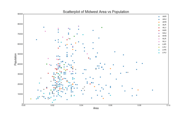
1. 散点图(Scatter plot)
散点图是用于研究两个变量之间关系的经典的和基本的图表。 如果数据中有多个组,则可能需要以不同颜色可视化每个组。 在 matplotlib 中,您可以使用 plt.scatterplot() 方便地执行此操作。
# Import dataset
midwest = pd.read_csv("https://raw.githubusercontent.com/selva86/datasets/master/midwest_filter.csv")

# Prepare Data
# Create as many colors as there are unique midwest['category']
categories = np.unique(midwest['category'])
colors = [plt.cm.tab10(i/float(len(categories)-1)) for i in range(len(categories))]

# Draw Plot for Each Category
plt.figure(figsize=(16, 10), dpi= 80, facecolor='w', edgecolor='k')

for i, category in enumerate(categories):
    plt.scatter('area', 'poptotal',
                data=midwest.loc[midwest.category==category, :],
                s=20, c=colors[i], label=str(category))

# Decorations
plt.gca().set(xlim=(0.0, 0.1), ylim=(0, 90000),
              xlabel='Area', ylabel='Population')

plt.xticks(fontsize=12); plt.yticks(fontsize=12)
plt.title("Scatterplot of Midwest Area vs Population", fontsize=22)
plt.legend(fontsize=12)
plt.show()
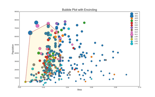
2. 带边界的气泡图(Bubble plot with Encircling)
有时,您希望在边界内显示一组点以强调其重要性。 在这个例子中,你从数据框中获取记录,并用下面代码中描述的 encircle() 来使边界显示出来。
from matplotlib import patches
from scipy.spatial import ConvexHull
import warnings; warnings.simplefilter('ignore')
sns.set_style("white")

# Step 1: Prepare Data
midwest = pd.read_csv("https://raw.githubusercontent.com/selva86/datasets/master/midwest_filter.csv")

# As many colors as there are unique midwest['category']
categories = np.unique(midwest['category'])
colors = [plt.cm.tab10(i/float(len(categories)-1)) for i in range(len(categories))]

# Step 2: Draw Scatterplot with unique color for each category
fig = plt.figure(figsize=(16, 10), dpi= 80, facecolor='w', edgecolor='k')

for i, category in enumerate(categories):
    plt.scatter('area', 'poptotal', data=midwest.loc[midwest.category==category, :], s='dot_size', c=colors[i], label=str(category), edgecolors='black', linewidths=.5)

# Step 3: Encircling
# https://stackoverflow.com/questions/44575681/how-do-i-encircle-different-data-sets-in-scatter-plot
def encircle(x,y, ax=None, **kw):
    if not ax: ax=plt.gca()
    p = np.c_[x,y]
    hull = ConvexHull(p)
    poly = plt.Polygon(p[hull.vertices,:], **kw)
    ax.add_patch(poly)

# Select data to be encircled
midwest_encircle_data = midwest.loc[midwest.state=='IN', :]

# Draw polygon surrounding vertices
encircle(midwest_encircle_data.area, midwest_encircle_data.poptotal, ec="k", fc="gold", alpha=0.1)
encircle(midwest_encircle_data.area, midwest_encircle_data.poptotal, ec="firebrick", fc="none", linewidth=1.5)

# Step 4: Decorations
plt.gca().set(xlim=(0.0, 0.1), ylim=(0, 90000),
              xlabel='Area', ylabel='Population')

plt.xticks(fontsize=12); plt.yticks(fontsize=12)
plt.title("Bubble Plot with Encircling", fontsize=22)
plt.legend(fontsize=12)
plt.show()
3. 带线性回归最佳拟合线的散点图 (Scatter plot with linear regression line of best fit)
如果你想了解两个变量如何相互改变,那么最佳拟合线就是常用的方法。 下图显示了数据中各组之间最佳拟合线的差异。 要禁用分组并仅为整个数据集绘制一条最佳拟合线,请从下面的 sns.lmplot()调用中删除 hue ='cyl'参数。
# Import Data
df = pd.read_csv("https://raw.githubusercontent.com/selva86/datasets/master/mpg_ggplot2.csv")
df_select = df.loc[df.cyl.isin([4,8]), :]

# Plot
sns.set_style("white")
gridobj = sns.lmplot(x="displ", y="hwy", hue="cyl", data=df_select,
                     height=7, aspect=1.6, robust=True, palette='tab10',
                     scatter_kws=dict(s=60, linewidths=.7, edgecolors='black'))

# Decorations
gridobj.set(xlim=(0.5, 7.5), ylim=(0, 50))
plt.title("Scatterplot with line of best fit grouped by number of cylinders", fontsize=20)
plt.show()

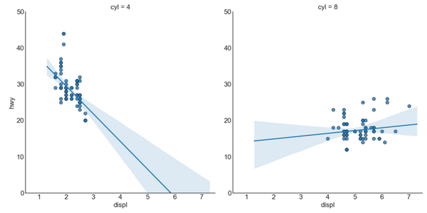
针对每列绘制线性回归线:
或者,可以在其每列中显示每个组的最佳拟合线。 可以通过在 sns.lmplot() 中设置 col=groupingcolumn 参数来实现,如下:
# Import Data
df = pd.read_csv("https://raw.githubusercontent.com/selva86/datasets/master/mpg_ggplot2.csv")
df_select = df.loc[df.cyl.isin([4,8]), :]

# Each line in its own column
sns.set_style("white")
gridobj = sns.lmplot(x="displ", y="hwy",
                     data=df_select,
                     height=7,
                     robust=True,
                     palette='Set1',
                     col="cyl",
                     scatter_kws=dict(s=60, linewidths=.7, edgecolors='black'))

# Decorations
gridobj.set(xlim=(0.5, 7.5), ylim=(0, 50))
plt.show()
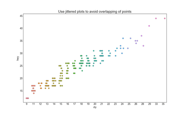
4. 抖动图 (Jittering with stripplot)
通常,多个数据点具有完全相同的 X 和 Y 值。 结果,多个点绘制会重叠并隐藏。 为避免这种情况,请将数据点稍微抖动,以便您可以直观地看到它们。 使用 seaborn 的 stripplot() 很方便实现这个功能。
# Import Data
df = pd.read_csv("https://raw.githubusercontent.com/selva86/datasets/master/mpg_ggplot2.csv")

# Draw Stripplot
fig, ax = plt.subplots(figsize=(16,10), dpi= 80)
sns.stripplot(df.cty, df.hwy, jitter=0.25, size=8, ax=ax, linewidth=.5)

# Decorations
plt.title('Use jittered plots to avoid overlapping of points', fontsize=22)
plt.show()
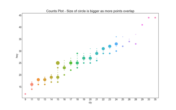
5. 计数图 (Counts Plot)
避免点重叠问题的另一个选择是增加点的大小,这取决于该点中有多少点。 因此,点的大小越大,其周围的点的集中度越高。
# Import Data
df = pd.read_csv("https://raw.githubusercontent.com/selva86/datasets/master/mpg_ggplot2.csv")
df_counts = df.groupby(['hwy', 'cty']).size().reset_index(name='counts')

# Draw Stripplot
fig, ax = plt.subplots(figsize=(16,10), dpi= 80)
sns.stripplot(df_counts.cty, df_counts.hwy, size=df_counts.counts*2, ax=ax)

# Decorations
plt.title('Counts Plot - Size of circle is bigger as more points overlap', fontsize=22)
plt.show()
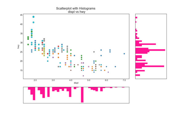
6. 边缘直方图 (Marginal Histogram)
边缘直方图具有沿 X 和 Y 轴变量的直方图。 这用于可视化 X 和 Y 之间的关系以及单独的 X 和 Y 的单变量分布。 这种图经常用于探索性数据分析(EDA)。
# Import Data
df = pd.read_csv("https://raw.githubusercontent.com/selva86/datasets/master/mpg_ggplot2.csv")

# Create Fig and gridspec
fig = plt.figure(figsize=(16, 10), dpi= 80)
grid = plt.GridSpec(4, 4, hspace=0.5, wspace=0.2)

# Define the axes
ax_main = fig.add_subplot(grid[:-1, :-1])
ax_right = fig.add_subplot(grid[:-1, -1], xticklabels=[], yticklabels=[])
ax_bottom = fig.add_subplot(grid[-1, 0:-1], xticklabels=[], yticklabels=[])

# Scatterplot on main ax
ax_main.scatter('displ', 'hwy', s=df.cty*4, c=df.manufacturer.astype('category').cat.codes, alpha=.9, data=df, cmap="tab10", edgecolors='gray', linewidths=.5)

# histogram on the right
ax_bottom.hist(df.displ, 40, histtype='stepfilled', orientation='vertical', color='deeppink')
ax_bottom.invert_yaxis()

# histogram in the bottom
ax_right.hist(df.hwy, 40, histtype='stepfilled', orientation='horizontal', color='deeppink')

# Decorations
ax_main.set(title='Scatterplot with Histograms \n displ vs hwy', xlabel='displ', ylabel='hwy')
ax_main.title.set_fontsize(20)
for item in ([ax_main.xaxis.label, ax_main.yaxis.label] + ax_main.get_xticklabels() + ax_main.get_yticklabels()):
    item.set_fontsize(14)

xlabels = ax_main.get_xticks().tolist()
ax_main.set_xticklabels(xlabels)
plt.show()
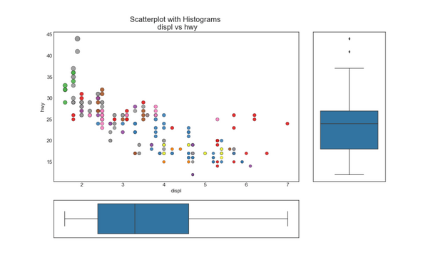
7. 边缘箱形图 (Marginal Boxplot)
边缘箱图与边缘直方图具有相似的用途。 然而,箱线图有助于精确定位 X 和 Y 的中位数、第25和第75百分位数。
# Import Data
df = pd.read_csv("https://raw.githubusercontent.com/selva86/datasets/master/mpg_ggplot2.csv")

# Create Fig and gridspec
fig = plt.figure(figsize=(16, 10), dpi= 80)
grid = plt.GridSpec(4, 4, hspace=0.5, wspace=0.2)

# Define the axes
ax_main = fig.add_subplot(grid[:-1, :-1])
ax_right = fig.add_subplot(grid[:-1, -1], xticklabels=[], yticklabels=[])
ax_bottom = fig.add_subplot(grid[-1, 0:-1], xticklabels=[], yticklabels=[])

# Scatterplot on main ax
ax_main.scatter('displ', 'hwy', s=df.cty*5, c=df.manufacturer.astype('category').cat.codes, alpha=.9, data=df, cmap="Set1", edgecolors='black', linewidths=.5)

# Add a graph in each part
sns.boxplot(df.hwy, ax=ax_right, orient="v")
sns.boxplot(df.displ, ax=ax_bottom, orient="h")

# Decorations ------------------
# Remove x axis name for the boxplot
ax_bottom.set(xlabel='')
ax_right.set(ylabel='')

# Main Title, Xlabel and YLabel
ax_main.set(title='Scatterplot with Histograms \n displ vs hwy', xlabel='displ', ylabel='hwy')

# Set font size of different components
ax_main.title.set_fontsize(20)
for item in ([ax_main.xaxis.label, ax_main.yaxis.label] + ax_main.get_xticklabels() + ax_main.get_yticklabels()):
    item.set_fontsize(14)

plt.show()
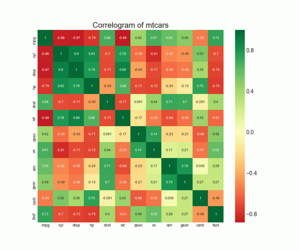
8. 相关图 (Correllogram)
相关图用于直观地查看给定数据框(或二维数组)中所有可能的数值变量对之间的相关度量。
# Import Dataset
df = pd.read_csv("https://github.com/selva86/datasets/raw/master/mtcars.csv")

# Plot
plt.figure(figsize=(12,10), dpi= 80)
sns.heatmap(df.corr(), xticklabels=df.corr().columns, yticklabels=df.corr().columns, cmap='RdYlGn', center=0, annot=True)

# Decorations
plt.title('Correlogram of mtcars', fontsize=22)
plt.xticks(fontsize=12)
plt.yticks(fontsize=12)
plt.show()
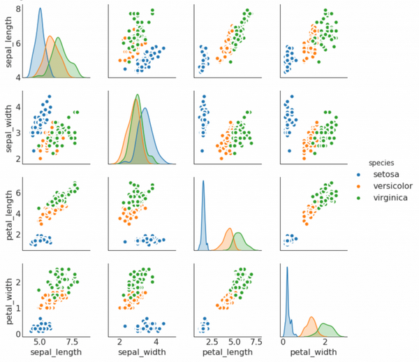
9. 矩阵图 (Pairwise Plot)
矩阵图是探索性分析中的最爱,用于理解所有可能的数值变量对之间的关系。 它是双变量分析的必备工具。
# Load Dataset
df = sns.load_dataset('iris')

# Plot
plt.figure(figsize=(10,8), dpi= 80)
sns.pairplot(df, kind="scatter", hue="species", plot_kws=dict(s=80, edgecolor="white", linewidth=2.5))
plt.show()
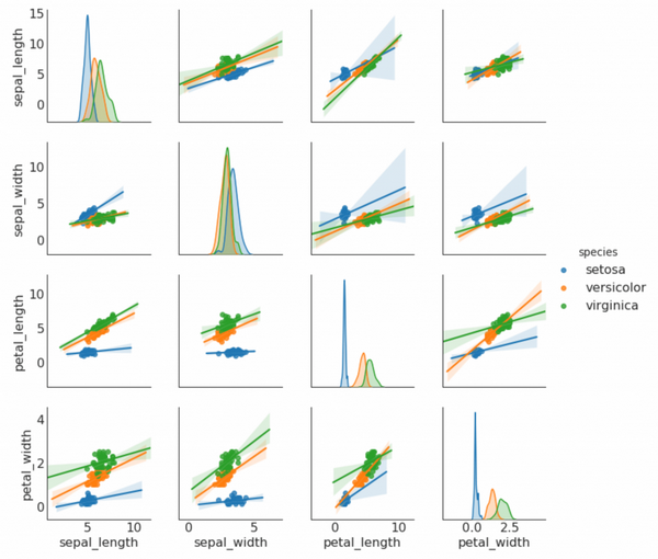
# Load Dataset
df = sns.load_dataset('iris')

# Plot
plt.figure(figsize=(10,8), dpi= 80)
sns.pairplot(df, kind="reg", hue="species")
plt.show()
二、偏差 (Deviation)
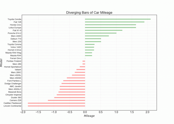
10. 发散型条形图 (Diverging Bars)
如果您想根据单个指标查看项目的变化情况,并可视化此差异的顺序和数量,那么散型条形图 (Diverging Bars) 是一个很好的工具。 它有助于快速区分数据中组的性能,并且非常直观,并且可以立即传达这一点。
# Prepare Data
df = pd.read_csv("https://github.com/selva86/datasets/raw/master/mtcars.csv")
x = df.loc[:, ['mpg']]
df['mpg_z'] = (x - x.mean())/x.std()
df['colors'] = ['red' if x < 0 else 'green' for x in df['mpg_z']]
df.sort_values('mpg_z', inplace=True)
df.reset_index(inplace=True)

# Draw plot
plt.figure(figsize=(14,10), dpi= 80)
plt.hlines(y=df.index, xmin=0, xmax=df.mpg_z, color=df.colors, alpha=0.4, linewidth=5)

# Decorations
plt.gca().set(ylabel='$Model$', xlabel='$Mileage$')
plt.yticks(df.index, df.cars, fontsize=12)
plt.title('Diverging Bars of Car Mileage', fontdict={'size':20})
plt.grid(linestyle='--', alpha=0.5)
plt.show()
版权申明:本站文章部分自网络,如有侵权,请联系:west999com@outlook.com
特别注意:本站所有转载文章言论不代表本站观点!
本站所提供的图片等素材,版权归原作者所有,如需使用,请与原作者联系。