
25个强大的CSS代码,据说这些是开发者经常遇到比…
2019-08-26 06:28:10来源:博客园 阅读 ()

25个强大的CSS代码,据说这些是开发者经常遇到比较棘手的代码
这些代码是经常用到的,比方说一些特殊的效果,圆角边框,CSS透明度,梯形环绕,CSS小三角等,希望对你有用
1简单又好的 Blockquote 样式

CSS代码如下
blockquote {
  background:#f9f9f9;
  border-left:10px solid #ccc;
  margin:1.5em 10px;
  padding:.5em 10px;
  quotes:"\201C""\201D""\2018""\2019";
}
blockquote:before {
  color:#ccc;
  content:open-quote;
  font-size:4em;
  line-height:.1em;
  margin-right:.25em;
  vertical-align:-.4em;
}
blockquote p {
    display:inline;
}
2图像在水平或者垂直方向的绝对定位
css代码
img {
   position: absolute;
   top: 50%;
   left: 50%;
   width: 500px;
   height: 500px;
   margin-top: -250px; /* Half the height */
   margin-left: -250px; /* Half the width */
}
3用PHP压缩CSS代码
<?php
    ob_start ("ob_gzhandler");
    header("Content-type: text/css; charset: UTF-8");
    header("Cache-Control: must-revalidate");
    $offset = 60 * 60 ;
    $ExpStr = "Expires: " .
    gmdate("D, d M Y H:i:s",
    time() + $offset) . " GMT";
    header($ExpStr);
?>
body { color: red; }
4如何用css实现小三角形符号
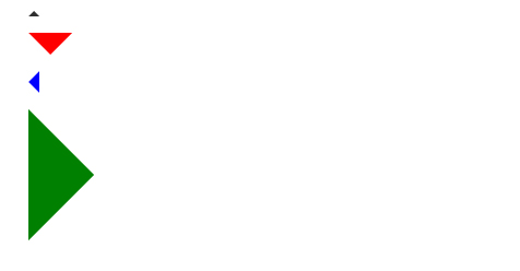
具体代码如下 首先是html代码
<div class="arrow-up"></div>
<div class="arrow-down"></div>
<div class="arrow-left"></div>
<div class="arrow-right"></div>
css代码
.arrow-up {
    width: 0;
    height: 0;
    border-left: 5px solid transparent;
    border-right: 5px solid transparent;

    border-bottom: 5px solid black;
}

.arrow-down {
    width: 0;
    height: 0;
    border-left: 20px solid transparent;
    border-right: 20px solid transparent;

    border-top: 20px solid #f00;
}

.arrow-right {
    width: 0;
    height: 0;
    border-top: 60px solid transparent;
    border-bottom: 60px solid transparent;

    border-left: 60px solid green;
}

.arrow-left {
    width: 0;
    height: 0;
    border-top: 10px solid transparent;
    border-bottom: 10px solid transparent;

    border-right:10px solid blue;
}
5.翻转图片
CSS代码
img {
    -moz-transform: scaleX(-1);
    -o-transform: scaleX(-1);
    -webkit-transform: scaleX(-1);
    transform: scaleX(-1);
    filter: FlipH;
    -ms-filter: "FlipH";
}
用这些代码可以实现图像的360的翻转,效果如下,没有翻转前的图片
翻转后的图片
6 Clearfix
.clearfix:after {
    visibility: hidden;
    display: block;
    font-size: 0;
    content: " ";
    clear: both;
    height: 0;
}

.clearfix { display: inline-block; }

/* start commented backslash hack \*/
* html .clearfix { height: 1%; }
.clearfix { display: block; }
/* close commented backslash hack */
7 在IE6中的固定定位
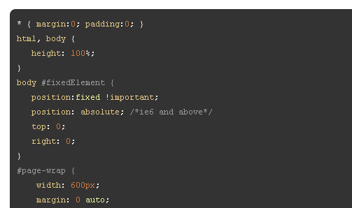
8 隐藏和文本文字缩进
h1 {
    text-indent:-9999px;
    margin:0 auto;
    width:400px;
    height:100px;
    background:transparent url("images/logo.jpg") no-repeat scroll;
}
上面CSS代码设置text-indent 为负值,正好文字移到了左边,可以实现部分文字隐藏
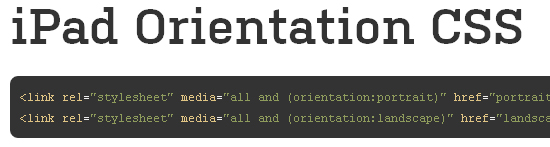
9在iPad当中定位CSS代码
10根据不同的文件类型,展示不同的链接,看下面的代码
/* external links */
a[href^="http://"]{
    padding-right: 20px;
    background: url(external.gif) no-repeat center right;
}

/* emails */
a[href^="mailto:"]{
    padding-right: 20px;
    background: url(email.png) no-repeat center right;
}

/* pdfs */
a[href$=".pdf"]{
    padding-right: 20px;
    background: url(pdf.png) no-repeat center right;
}
此代码段经常被用来增加用户体验的。经常在互联网上我们发现一些链接移动到上面的时候会显示不同的小图标。可以使用此代码段,你告诉用户是否它一个外部链接、 电子邮件、 pdf、或者其他图标
11 边框圆角
.round{
    -moz-border-radius: 10px;
    -webkit-border-radius: 10px;
    border-radius: 10px; /* future proofing */
    -khtml-border-radius: 10px; /* for old Konqueror browsers */
}
12 去除textarea在IE当中的滚动条效果
textarea{
    overflow:auto;
}
13 使页面在中央
.wrapper {
    width:960px;
    margin:0 auto;
}
14 CSS文字阴影效果
p { text-shadow: 1px 1px 1px #000; }15 CSS透明度
一谈到透明度问题,这个真是令人头疼,明明在火狐和谷歌浏览器当中效果看到好好的,在IE当中浏览就变了味,好在可以通过下面的CSS代码解决
.transparent {
    filter:alpha(opacity=50);
    -moz-opacity:0.5;
    -khtml-opacity: 0.5;
    opacity: 0.5;
}
16 垂直居中
.container {
    min-height: 10em;
    display: table-cell;
    vertical-align: middle;
}
17 Min-height in IE
.box {
min-height:500px;
height:auto !important;
height:500px;
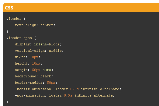
}18 使gif图像可以来回蹦跳
19 打印分页符
.page-break{
    page-break-before:always;
}
20 固定页脚位置
#footer {
   position:fixed;
   left:0px;
   bottom:0px;
   height:32px;
   width:100%;
   background:#333;
}
/* IE 6 */
* html #footer {
   position:absolute;
   top:expression((0-(footer.offsetHeight)+(document.documentElement.clientHeight ? document.documentElement.clientHeight : document.body.clientHeight)+(ignoreMe = document.documentElement.scrollTop ? document.documentElement.scrollTop : document.body.scrollTop))+'px');
}
21 文字旋转
.rotate {
    /* Safari */
    -webkit-transform: rotate(-90deg);
    /* Firefox */
    -moz-transform: rotate(-90deg);
    /* IE */
    -ms-transform: rotate(-90deg);
    /* Opera */
    -o-transform: rotate(-90deg);
    /* Internet Explorer */
    filter: progid:DXImageTransform.Microsoft.BasicImage(rotation=3);
}
22 A链接伪类(按顺序)
CSS代码
a:link {color: blue;}
a:visited {color: purple;}
a:hover {color: red;}
a:active {color: yellow;}
23 设置ul阴影效果和边框圆角
CSS代码如下
ul.box {
position: relative;
z-index: 1; /* prevent shadows falling behind containers with backgrounds */
overflow: hidden;
list-style: none;
margin: 0;
padding: 0;
}
ul.box li {
position: relative;
float: left;
width: 250px;
height: 150px;
padding: 0;
border: 1px solid #efefef;
margin: 0 30px 30px 0;
background: #fff;
-webkit-box-shadow: 0 1px 4px rgba(0, 0, 0, 0.27), 0 0 40px rgba(0, 0, 0, 0.06) inset;
-moz-box-shadow: 0 1px 4px rgba(0, 0, 0, 0.27), 0 0 40px rgba(0, 0, 0, 0.06) inset;
box-shadow: 0 1px 4px rgba(0, 0, 0, 0.27), 0 0 40px rgba(0, 0, 0, 0.06) inset;
}
ul.box li:before, ul.box li:after {
content: '';
z-index: -1;
position: absolute;
left: 10px;
bottom: 10px;
width: 70%;
max-width: 300px; /* avoid rotation causing ugly appearance at large container widths */
max-height: 100px;
height: 55%;
-webkit-box-shadow: 0 8px 16px rgba(0, 0, 0, 0.3);
-moz-box-shadow: 0 8px 16px rgba(0, 0, 0, 0.3);
box-shadow: 0 8px 16px rgba(0, 0, 0, 0.3);
-webkit-transform: skew(-15deg) rotate(-6deg);
-moz-transform: skew(-15deg) rotate(-6deg);
-ms-transform: skew(-15deg) rotate(-6deg);
-o-transform: skew(-15deg) rotate(-6deg);
transform: skew(-15deg) rotate(-6deg);
}
ul.box li:after {
left: auto;
right: 10px;
-webkit-transform: skew(15deg) rotate(6deg);
-moz-transform: skew(15deg) rotate(6deg);
-ms-transform: skew(15deg) rotate(6deg);
-o-transform: skew(15deg) rotate(6deg);
transform: skew(15deg) rotate(6deg);
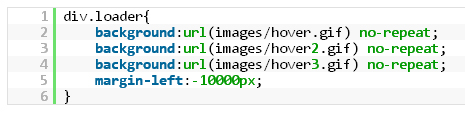
}24图片预加载功能
25 设计梯子型文字
h1 {
  font-size: 72px;
  background: -webkit-gradient(linear, left top, left bottom, from(#eee), to(#333));
  -webkit-background-clip: text;
  -webkit-text-fill-color: transparent;
}
原文链接:https://www.cnblogs.com/alterem/p/11398154.html
如有疑问请与原作者联系
标签:
版权申明:本站文章部分自网络,如有侵权,请联系:west999com@outlook.com
特别注意:本站所有转载文章言论不代表本站观点,本站所提供的摄影照片,插画,设计作品,如需使用,请与原作者联系,版权归原作者所有

- Mybatis 强大的结果集映射器resultMap 2020-05-24
- 重磅!!Redis 6.0.0 已发布,有史以来改变最大的版本 2020-05-22
- LeetCode 面试题17. 打印从1到最大的n位数 2020-05-05
- 让网页变灰的实现_网站蒙灰CSS样式总汇 2020-04-26
- LeetCode 84. 柱状图中最大的矩形 2020-04-05
IDC资讯: 主机资讯 注册资讯 托管资讯 vps资讯 网站建设
网站运营: 建站经验 策划盈利 搜索优化 网站推广 免费资源
网络编程: Asp.Net编程 Asp编程 Php编程 Xml编程 Access Mssql Mysql 其它
服务器技术: Web服务器 Ftp服务器 Mail服务器 Dns服务器 安全防护
软件技巧: 其它软件 Word Excel Powerpoint Ghost Vista QQ空间 QQ FlashGet 迅雷
网页制作: FrontPages Dreamweaver Javascript css photoshop fireworks Flash
