
CSS常用布局方式-两列布局、三列布局
2019-11-22 09:32:58来源:博客园 阅读 ()

CSS常用布局方式-两列布局、三列布局
CSS基础
2.几种布局方式
1)table布局
当年主流的布局方式,第一种是通过table tr td布局
示例:
<style type="text/css">
table{
width: 800px;
height: 300px;
border-collapse: collapse;
}
.left{
background-color: red;

}
.right{
background-color: blue;
}
</style>
<body>
<table>
<tr>
<td class="left">左</td>
<td class="right">右</td>
</tr>
</table>
</body>
页面效果: 文字自动垂直居中,很方便 同样可以设置左右的width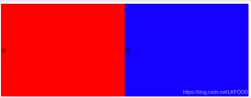
第二种是类比表格的table class
示例:
<style type="text/css">
.table{
display: table;
width: 800px;
height: 300px;
/*border-collapse: collapse;*/

}
.tb_row{
display: table-row;
}

.tb_cell{
display: table-cell;
vertical-align: middle;
}


.left{
background-color: red;
}
.right{
background-color: blue;
}
table
</style>
<body>
<div class="table">
<div class="tb_row">
<div class="left tb_cell">左</div>
<div class="right tb_cell">右</div>
</div>
</div>
</body>
页面效果: 跟表格布局一样 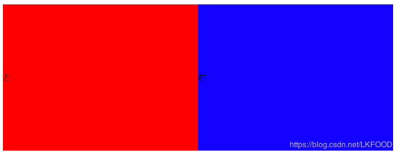
2)flexbox布局
- 两列布局
**关键:父级元素设置display:flex**
示例:
<style type="text/css">
*{
margin: 0;
padding: 0;
}
.parent{
width: 800px;
height: 300px;
display: flex;
}
.left{
width: 300px;
height: 100%;
background: red;
}
.right{
flex: 1;
height: 100%;
background: blue;
}

</style>

<body>
<div class="parent">
<div class="left">左</div>
<div class="right">右</div>
</div>
</body>
页面效果: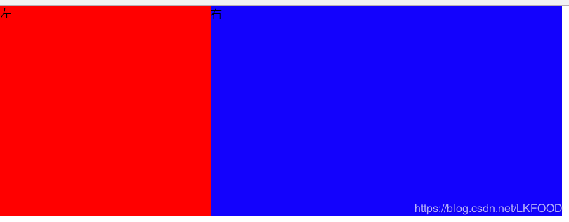
- 三列布局
**关键:父级元素设置display:flex**
示例:
<style type="text/css">
*{
margin: 0;
padding: 0;
}
.parent{
width: 800px;
height: 300px;
display: flex;
}
.left{
width: 300px;
height: 100%;
background: red;
}
.middle{
width: 200px;
height: 100%;
}
.right{
flex: 1;
height: 100%;
background: blue;
}

</style>
<body>
<div class="parent">
<div class="left">左</div>
<div class="middle">中</div>
<div class="right">右</div>
</div>
</body>
页面效果: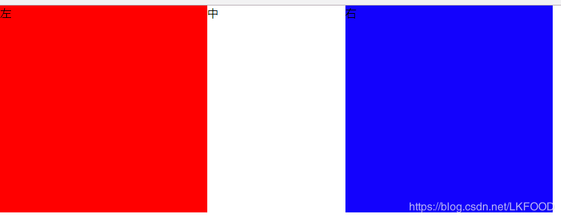
3)float布局 (float+margin)
兼容性好 但是要注意清楚浮动(clear: both display:block)
- 两列布局——左侧定宽,右侧自适应
**关键:**
*左侧设置float:left
右侧:margin-left: leftWidth*
示例:
<style>
*{
margin: 0;
padding: 0;
}

.parent{
width:800px;
height:200px;
}
.left{
width:200px;
height:100%;
float:left;
background-color:red;
}
.right{
height:100%;
margin-left:200px;
background-color:blue;
}
</style>
<body>
<div class="parent">
<div class="left">左</div>
<div class="left">右</div>
</div>
</body>
页面效果: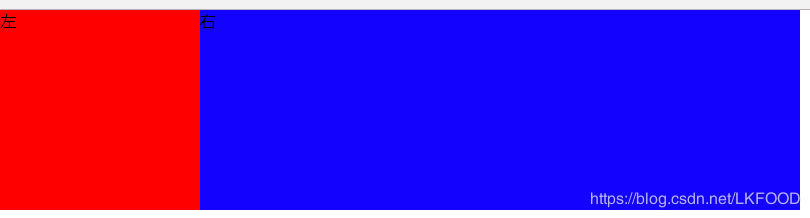
- 三列布局
**关键:**
*左侧设置float:left
右侧设置float:right
中间:margin-left: leftWidth;margin-right:rightWidth*
示例:
<style type="text/css">
*{
margin: 0;
padding: 0;
}
.parent{
width: 800px;
height: 200px;
}
.left{
width: 200px;
height: 100%;
background-color: red;
float: left;
}


.right{
float: right;
width: 200px;
background-color: blue;
height: 100%;
}

.middle{
margin-left: 200px;
margin-right: 200px;
}
</style>

<body>
<div class="parent">
<div class="left">左</div>
<div class="right">右</div>
<div class="middle">中</div>

</div>
</body>
页面效果: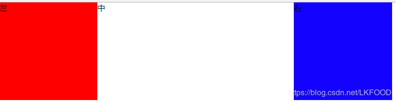
**注意:float特点:尽量靠上,尽量靠左(右),所以右侧浮动div要先写,中间div后写**
4)inline-block布局——不存在清除浮动问题 适用与定宽的布局
<style type="text/css">

.parent{
font-size: 0;
width: 800px;
height: 200px;
}
.left{
font-size: 14px;
width: 300px;
height: 200px;
display: inline-block;
background-color: red;
}
.right{
font-size: 14px;
width: 500px;
height: 200px;
display: inline-block;
background-color: blue;
}
</style>
<div class="parent">
<div class="left">左</div>
<div class="right">右</div>
</div>
页面效果: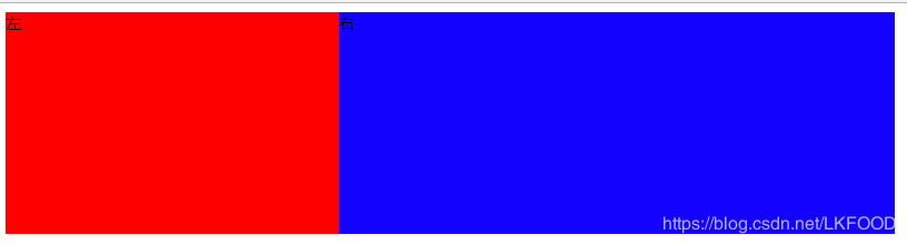
注意: 想要父级元素的宽度等于两个子元素宽度之和,需要设置父级元素的 font-size:0 否则两个子元素不会再一行展示
同时,需要设置两个子元素的font-size: 14px; 否则子元素内的文字不会展示!
**想象成文字,注意间隙的处理!!!** 间隙存在于两个div间的空白: 
5)响应式布局
让前台页面可以再不同的设备,不同大小的屏幕上正常展示,一般都是指处理屏幕大小问题
首先设置viewport
利用rem 1rem=html.font-size
<meta name="viewport" content="width=device-width,initial-scale=1.0">
利用media query
@media (max-width: 640px){
.left{
display: none;
}
}
三.Q&A
1) position: absolute 和fixed 的区别:
前者是相对于最近的relative/absolute 元素
后者是相对于屏幕 (viewport)
2) display:inline-block 间隙的原因
原因: 空白字符间距
解决:清除空白字符或者消灭间距
—中间不留空白
<div>
</div></div>
</div>
—将空白字符注释
<div>
</div><!--
--><div></div>
—消灭间距
font-size: 0
3)如何清除浮动以及原因
浮动的元素不占用父元素的空间,有可能会超出父元素进而对其他元素产生影响,所以要清除父元素浮动
方法:
让盒子负责自己的布局:
overflow: hidden(auto)
在元素后面加上:
::after{clear: both}
4)如何适配移动端页面
- viewport
- rem/viewport/media query
- 设计上: 隐藏 折行 自适应
原文链接:https://www.cnblogs.com/lk-food/p/11912345.html
如有疑问请与原作者联系
标签:
版权申明:本站文章部分自网络,如有侵权,请联系:west999com@outlook.com
特别注意:本站所有转载文章言论不代表本站观点,本站所提供的摄影照片,插画,设计作品,如需使用,请与原作者联系,版权归原作者所有

- DIV居中的经典方法 2020-06-13
- CSS中的float和margin的混合使用 2020-06-11
- Html/css 列表项 区分列表首尾 2020-06-11
- css与javascript重难点,学前端,基础不好一切白费! 2020-06-11
- ie8下透明度处理 2020-06-11
IDC资讯: 主机资讯 注册资讯 托管资讯 vps资讯 网站建设
网站运营: 建站经验 策划盈利 搜索优化 网站推广 免费资源
网络编程: Asp.Net编程 Asp编程 Php编程 Xml编程 Access Mssql Mysql 其它
服务器技术: Web服务器 Ftp服务器 Mail服务器 Dns服务器 安全防护
软件技巧: 其它软件 Word Excel Powerpoint Ghost Vista QQ空间 QQ FlashGet 迅雷
网页制作: FrontPages Dreamweaver Javascript css photoshop fireworks Flash
