
CSS3/CSS之居中解析(水平+垂直居中、水平居中,…
2019-11-26 16:00:56来源:博客园 阅读 ()

CSS3/CSS之居中解析(水平+垂直居中、水平居中,垂直居中)
首先,我们来看下垂直居中:
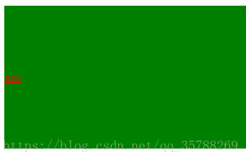
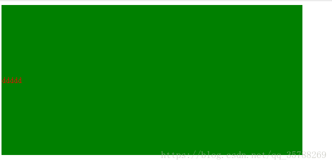
(1)、如果是单行文本,则可以设置的line-height的数值,让其等于父级元素的高度!
<!DOCTYPE html>
<html lang="en">
<head>
    <meta charset="UTF-8">
    <meta name="viewport" content="width=device-width, initial-scale=1.0">
    <meta http-equiv="X-UA-Compatible" content="ie=edge">
    <title>Document</title>
    <style>
        .box{
            background: green;
            height:200px;
        }
        a {height:100%;
        line-height: 200px;
        color:red;
}
 </style>
</head>
<body>
   <div class="box">
       <a href="">ggg </a>
   </div>
</body>
</html>
(2)、如果元素是行内块级元素,一般会使用diaplay:inline-block,vertical-align:middle,还有一个伪元素让元素内容处于容器中央!给父元素添加伪元素!
<!DOCTYPE html>
<html lang="en">
<head>
    <meta charset="UTF-8">
    <meta name="viewport" content="width=device-width, initial-scale=1.0">
    <meta http-equiv="X-UA-Compatible" content="ie=edge">
    <title>Document</title>
    <style>
        .box {
            background: green;
            height:200px;
        }
     .box::after, .box2{
         display:inline-block;
         vertical-align: middle;
     }
     .box::after{
         content:'';
         height:100%;
     }
     .box2{background-color:red;width:20px;height:20px;}
 </style>
</head>
<body>
   <div class="box">
       <div class="box2"></div>
   </div>
</body>
</html>
(3)、通过display:flex来实现垂直居中;
父级:display:flex;
子元素:align-self:center;
<!DOCTYPE html>
<html lang="en">
<head>
    <meta charset="UTF-8">
    <meta name="viewport" content="width=device-width, initial-scale=1.0">
    <meta http-equiv="X-UA-Compatible" content="ie=edge">
    <title>Document</title>
    <style>
        .box {
            background: green;
            height:300px;
            width: 600px;
            display:flex;

        }
        .box2{background:red;
        width:30%;
        height:30%;
        align-self: center;

     }

 </style>
</head>
<body>
   <div class="box">
       <div class="box2"></div>
   </div>
</body>
</html>
(4)、使用display:table进行垂直居中!
给父元素设置display:table;子元素设置为display:table-cell;
<!DOCTYPE html>
<html lang="en">
<head>
    <meta charset="UTF-8">
    <meta name="viewport" content="width=device-width, initial-scale=1.0">
    <meta http-equiv="X-UA-Compatible" content="ie=edge">
    <title>Document</title>
    <style>
        .box {
            background-color: green;
            height:300px;
            width: 600px;
            display:table;
        }

       .box .box2{
           color:red;

        display:table-cell;
         vertical-align: middle;

}

 </style>
</head>
<body>
   <div class="box">
       <div class="box2">ddddd</div>
   </div>
</body>
</html>
(5),已经知道父元素的高度,给子元素相对定位,在通过translaY()得到垂直居中
<!DOCTYPE html>
<html lang="en">
<head>
    <meta charset="UTF-8">
    <meta name="viewport" content="width=device-width, initial-scale=1.0">
    <meta http-equiv="X-UA-Compatible" content="ie=edge">
    <title>Document</title>
    <style>
        .box {
            background-color: green;
            height:300px;
            width: 600px;

        }

       .box .box2{
           background-color:red;
            width:50%;
             height:50%;
             position: relative;
             top:50%;
             transform:translateY(-50%);
}

 </style>
</head>
<body>
   <div class="box">
       <div class="box2"></div>
   </div>
</body>
</html>

6)、父元素高度不知道,同过transform实现,先给父元素相对定位,在给子元素绝对定位

<!DOCTYPE html>
<html lang="en">
<head>
    <meta charset="UTF-8">
    <meta name="viewport" content="width=device-width, initial-scale=1.0">
    <meta http-equiv="X-UA-Compatible" content="ie=edge">
    <title>Document</title>
    <style>
        .box {
            background-color: green;
            height:300px;
            width: 600px;
            position: relative;
        }

       .box .box2{
           background-color:red;
            width:50%;
             height:50%;
             position: absolute;
             top:50%;
             transform:translateY(-50%);
}

 </style>
</head>
<body>
   <div class="box">
       <div class="box2"></div>
   </div>
</body>
</html>
二、水平居中:
(1)、行内元素方案,只要把行内元素包裹 在一个盒子中,并且在他父级元素添加如下属性:text-align:center;
<!DOCTYPE html>
<html lang="en">
<head>
    <meta charset="UTF-8">
    <meta name="viewport" content="width=device-width, initial-scale=1.0">
    <meta http-equiv="X-UA-Compatible" content="ie=edge">
    <title>Document</title>
    <style>
        .box {
            background-color: green;
            height:300px;
            width: 600px;
            text-align:center;
        }
      P{color:red;}
 </style>
</head>
<body>
   <div class="box">
       <p>1111</p>
   </div>
</body>
</html>

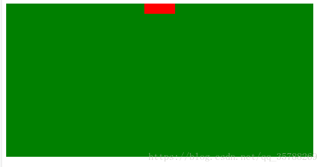
(2)、单个块状元素解决方案:
<!DOCTYPE html>
<html lang="en">
<head>
    <meta charset="UTF-8">
    <meta name="viewport" content="width=device-width, initial-scale=1.0">
    <meta http-equiv="X-UA-Compatible" content="ie=edge">
    <title>Document</title>
    <style>
        .box {
            background-color: green;
            height:300px;
            width: 600px;
            text-align:center;
        }
    .box2{
        background-color: red;
        width: 20px;
        height: 20px;
        margin:0 auto;
    }
 </style>
</head>
<body>
   <div class="box">
       <div class="box2"></div>
   </div>
</body>
</html>

3)、多个块状元素解决方案:父元素设置为text-align:center;子元素设置为:display:inline-block;

相信很多人在刚接触前端或者中期时候总会遇到一些问题及瓶颈期,如学了一段时间没有方向感或者坚持不下去一个人学习枯燥乏味有问题也不知道怎么解决,对此我整理了一些资料 喜欢我的文章想与更多资深大牛一起讨论和学习的话 欢迎加入我的学习交流群907694362
!DOCTYPE html>
<html lang="en">
<head>
    <meta charset="UTF-8">
    <meta name="viewport" content="width=device-width, initial-scale=1.0">
    <meta http-equiv="X-UA-Compatible" content="ie=edge">
    <title>Document</title>
    <style>
        .box {
            background-color: green;
            height:300px;
            width: 600px;
            text-align:center;
        }
    .box2, .box3{
        background-color: red;
        width: 20px;
        height: 20px;
        display:inline-block;
    }
 </style>
</head>
<body>
   <div class="box">
       <div class="box2"></div>
       <div class="box3"></div>
   </div>
</body>
</html>
也可以使用flexbox来实现:
<!DOCTYPE html>
<html lang="en">
<head>
    <meta charset="UTF-8">
    <meta name="viewport" content="width=device-width, initial-scale=1.0">
    <meta http-equiv="X-UA-Compatible" content="ie=edge">
    <title>Document</title>
    <style>
        .box {
            background-color: green;
            height:300px;
            width: 600px;
           display:flex;
           justify-content:center;
        }
    .box2, .box3, .box4{
        background-color: red;
        width: 20px;
        height: 20px;

    }
 </style>
</head>
<body>
   <div class="box">
       <div class="box2"></div>
       <div class="box3"></div>
       <div class="box4"></div>
   </div>
</body>
</html>
(4)、不定宽度块元素水平居中:
<!DOCTYPE html>
<html lang="en">
<head>
    <meta charset="UTF-8">
    <meta name="viewport" content="width=device-width, initial-scale=1.0">
    <meta http-equiv="X-UA-Compatible" content="ie=edge">
    <title>Document</title>
    <style>
        .box {
            float:left;
            position: relative;
            left:50%;
        }
    .box ul{
        position:relative;
        left:-50%;
    }
 </style>
</head>
<body>
   <div class="box">
       <ul>
           <li>1111</li>
           <li>111</li>
           <li>111</li>
       </ul>
   </div>
</body>
</html>
三:实现水平+垂直居中,也就是在中央:(1)单行行内元素:父元素设置:text-align:center,display:table-cell;vertical-align:middle,在这里,图片,文字,都是一样的操作
<!DOCTYPE html>
<html lang="en">
<head>
    <meta charset="UTF-8">
    <meta name="viewport" content="width=device-width, initial-scale=1.0">
    <meta http-equiv="X-UA-Compatible" content="ie=edge">
    <title>Document</title>
    <style>
        .box {
            background-color: #ccc;
            width:500px;
            height: 500px;
            display:table-cell;
            text-align: center;
            vertical-align: middle;
        }
        img{width:50px;
        height: 50px;}

 </style>
</head>
<body>
   <div class="box">
      <img src="5.jpg" alt="">
   </div>
</body>
</html>

文字在中央,还可以父级设置为text-align:center;line-height设置为父元素的height

<!DOCTYPE html>
<html lang="en">
<head>
    <meta charset="UTF-8">
    <meta name="viewport" content="width=device-width, initial-scale=1.0">
    <meta http-equiv="X-UA-Compatible" content="ie=edge">
    <title>Document</title>
    <style>
        .box {
            background-color: #ccc;
            width:500px;
            height: 500px;
            text-align: center;
        }

   p{line-height: 500px;}
 </style>
</head>
<body>
   <div class="box">
  <p>1111</p>

   </div>
</body>
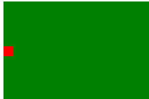
(2)对于单个块级元素,父元素设置为相对定位,子元素设置为绝对定位高度,宽度为50%
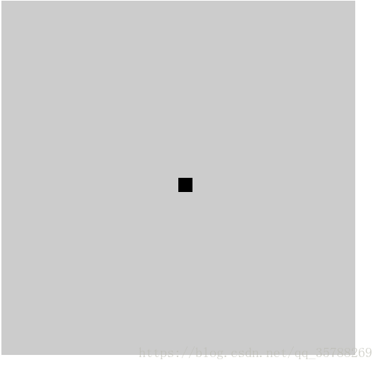
!DOCTYPE html>
<html lang="en">
<head>
    <meta charset="UTF-8">
    <meta name="viewport" content="width=device-width, initial-scale=1.0">
    <meta http-equiv="X-UA-Compatible" content="ie=edge">
    <title>Document</title>
    <style>
        .box {
            background-color: #ccc;
            width:500px;
            height: 500px;
            position: relative;
        }
        .box2{position: absolute;
        top:50%;
        left:50%;
        background-color: black;
        width: 20px;
        height: 20px;}

 </style>
</head>
<body>
   <div class="box">
       <div class="box2"></div>


   </div>
</body>
</html>
(3)、flex实现不定宽度水平+垂直居中
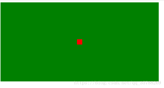
<!DOCTYPE html>
<html lang="en">
<head>
    <meta charset="UTF-8">
    <meta name="viewport" content="width=device-width, initial-scale=1.0">
    <meta http-equiv="X-UA-Compatible" content="ie=edge">
    <title>Document</title>
    <style>
        .box {
            background-color: green;
            height:300px;
            width: 600px;
           display:flex;
           justify-content:center;
           align-items:center;
        }
    .box2, .box3, .box4{
        background-color: red;
        width: 20px;
        height: 20px;

    }
 </style>
</head>
<body>
   <div class="box">
       <div class="box2"></div>

   </div>
</body>
</html>
推荐阅读:CSS边框长度控制
css样式的书写顺序及原理——很重要!
原文链接:https://blog.csdn.net/qq_35788269/article/details/80691114
<!DOCTYPE html><html lang="en"><head> <meta charset="UTF-8"> <meta name="viewport" content="width=device-width, initial-scale=1.0"> <meta http-equiv="X-UA-Compatible" content="ie=edge"> <title>Document</title> <style> .box{ background: green; height:200px; } a {height:100%; line-height: 200px; color:red;} </style></head><body> <div class="box"> <a href="">ggg </a> </div></body></html>————————————————版权声明:本文为CSDN博主「左手写爱等等」的原创文章,遵循 CC 4.0 BY-SA 版权协议,转载请附上原文出处链接及本声明。原文链接:https://blog.csdn.net/qq_35788269/article/details/80691114
原文链接:https://www.cnblogs.com/xsd1/p/11936313.html
如有疑问请与原作者联系
标签:
版权申明:本站文章部分自网络,如有侵权,请联系:west999com@outlook.com
特别注意:本站所有转载文章言论不代表本站观点,本站所提供的摄影照片,插画,设计作品,如需使用,请与原作者联系,版权归原作者所有

上一篇:图片翻转效果
- DIV居中的经典方法 2020-06-13
- CSS中的float和margin的混合使用 2020-06-11
- Html/css 列表项 区分列表首尾 2020-06-11
- css与javascript重难点,学前端,基础不好一切白费! 2020-06-11
- ie8下透明度处理 2020-06-11
IDC资讯: 主机资讯 注册资讯 托管资讯 vps资讯 网站建设
网站运营: 建站经验 策划盈利 搜索优化 网站推广 免费资源
网络编程: Asp.Net编程 Asp编程 Php编程 Xml编程 Access Mssql Mysql 其它
服务器技术: Web服务器 Ftp服务器 Mail服务器 Dns服务器 安全防护
软件技巧: 其它软件 Word Excel Powerpoint Ghost Vista QQ空间 QQ FlashGet 迅雷
网页制作: FrontPages Dreamweaver Javascript css photoshop fireworks Flash
