
HTML连载54-网易注册界面实战之信息填写
2019-12-01 11:23:18来源:博客园 阅读 ()
 HTML连载54-网易注册界面实战之信息填写
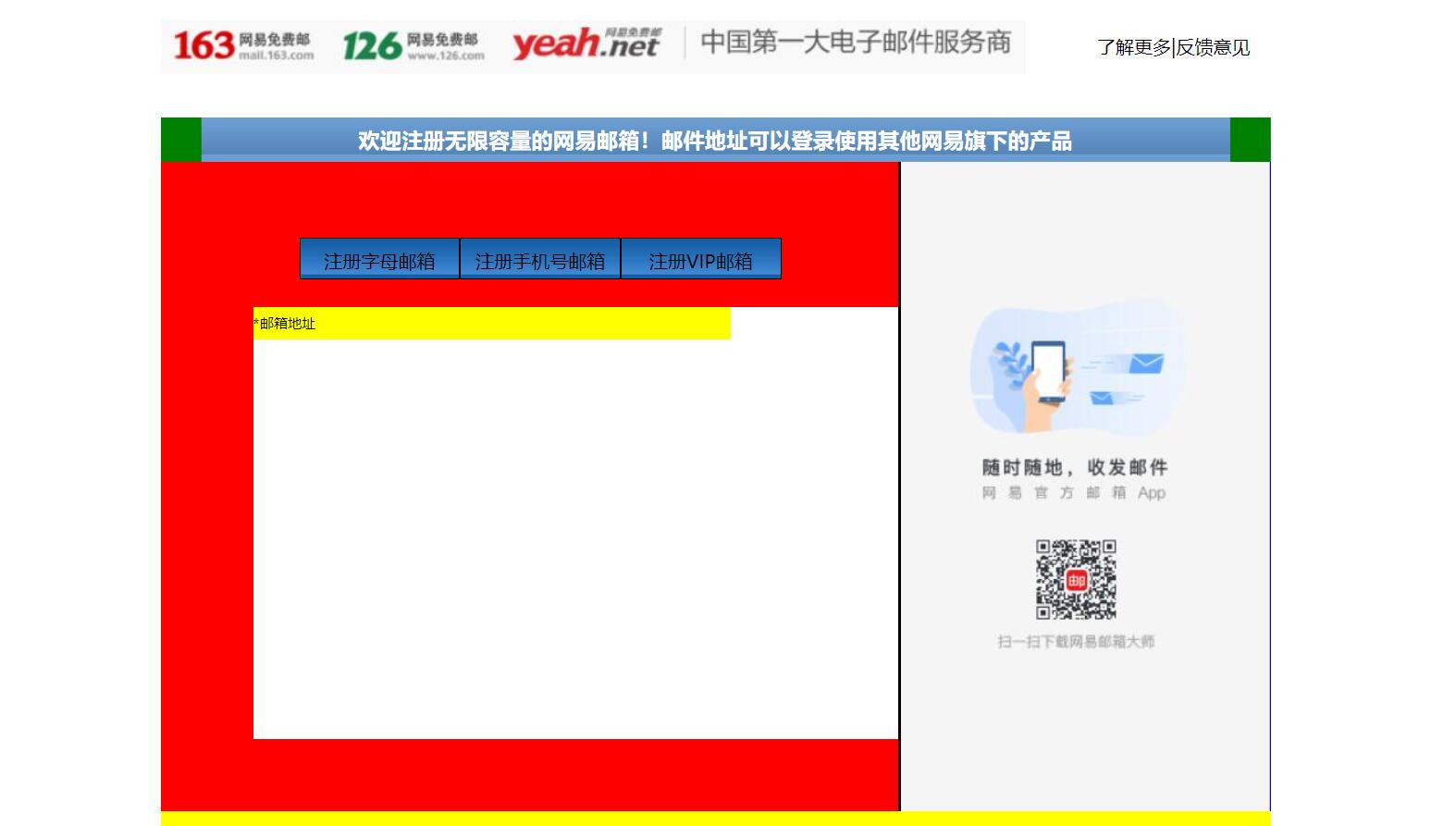
一、完成了内容中的右边的一部分。练习了三点:小盒子在大盒子中的位置,最好用大盒子的内边距完成布局,而不是用小盒子的外边距来进行布局;复习了ul,li的用法。
<!DOCTYPE html>

<html lang="en">

<head>

    <meta charset="UTF-8">

    <title>D139_FrameworkeOfNeteasyInterface</title>

    <style>

        .header{

            width:960px;

            height:80px;

            /*background-color: red;*/

            margin: 0 auto;

            overflow: hidden;

            padding-top:14px;

            box-sizing: border-box;/*这里我们采用内上边距的办法将logo挤下去达到垂直居中的目的*/

            /*同时这个box-sizing的属性就是将这个header固定住,不让他因为内边距而变化大小了*/

        }

        .content{

            width: 960px;

            height: 600px;

            background-color: blue;

            margin: 0 auto;

?

        }

        .footer{

            width: 960px;

            height: 48px;

            background-color: yellow;

            margin: 0 auto ;

        }

        .header .logo{

            width:748px;

            height: 47px;

            background:url("image/netEasyLogo.jpg") no-repeat 0 0;/*从图片的坐标(0,0)开始铺,no-repeat就是只铺这一张不要多铺*/

            /*margin-top: 12px;*/

            float:left;

        }

        .header .links{

            height: 42px;

            width: 150px;

            /*background-color: red;*/

            float:right;

        }

        .header .logo a {

            width:156px;

            height:45px;/*测量出那一块区域,然后这一块区域都是超级链接*/

            /*background-color: red;*/

            display: inline-block;/*转换为行内块级标签*/

        }

        .header .links a{

            text-decoration:none;/*去掉下划线*/

            font-size: 16px;

            color:black;

            line-height: 45px;/*这里复习了文字不能居中,使用这个属性让它和links盒子的高度一致,那就做到文字在盒子中居中*/

            text-align: right;/*复习了文字右对齐*/

        }

        .content{

            width: 960px;

            height: 600px;

?

        }

        .content .top{

            width: 960px;

            height: 38px;

            /*background-color: red;*/

            background: url("image/wangyi_center.jpg") 0 0;/*让这张小图片把top这个区域全部铺满*/

        }

        .content .bottom{

            width: 960px;

            height: 562px;

            /*background-color: green;*/

        }

        /*下面这两个属性设置,就是为了content的top部的两边能使用我们指定的格式,我们采用的盒子嵌套盒子来进行背景的演示*/

        .content .top .left{

            width:960px;

            height: 38px;

            background:url("image/line_left.jpg") no-repeat left 0 ;

            /*display: inline;*/

        }

        .content .top .left .right{

            width:960px;

            height: 38px;

            background:url("image/line_left.jpg") no-repeat right 0 ;

        }

        .content .top .left .right h3{

            color: white;

            line-height:38px;/*设置行高就是为了让文字能够在top条中垂直居中*/

            text-align: center;/*文字水平居中,当然我们也可以设置margin-left来设置左边距,但是一旦分辨率改变将导致网页变形*/

        }

        .content .bottom .article{

            width:638px;

            height: 562px;

            background-color: red;

            float:left;/*这里填写了这个float属性才行,并且右面的盒子也需要float属性,div是行内标签,不写float会另起一行*/

            box-sizing: border-box;/*这个设置是为了让外面的大盒子不会因为设置内边距,而导致外面的的大盒子变形*/

            padding-top:50px;/*这里我们设置了内边距,那么里面的内容就可以从这里面进行配置了,一开始我想到的是不设置这个内边距*/

            /*让里面的东西有外边距,当然这样也可以达到效果,但是有一个缺点,里面的每一个盒子都要单独设置外边距,相比设置*/

            /*外面盒子的内边距会更加省力,而且里面的内容,自然而然就会对齐*/

            padding-left: 80px;

        }

        .content .bottom .aside{

            width: 320px;/*这里我们本来写的322,但是发现写上322就会造成aside这个图片溢出到下面了,原来是左边距有2px.这样*/

            /*320+2+638=960就正好了,溢出原因就是float属性导致的,达到了962,就装不下了*/

            height: 562px;

            /*background-color: green;*/

            background:url("image/content_aside.jpg") no-repeat 0;

            float:right;

            border-left:2px black solid;

        }

        .content .article .articletop{

            width: 560px;

            height: 60px;

            /*background-color: yellow;*/

?

        }

        .content .article .articletop ul{

            width: 511px;

            height: 34px;

            /*background-color: tomato;*/

            list-style:none;/*这个属性是为了去掉li的小圆点*/

?

        }

        .content .article .articletop ul li{

            float:left;

            width: 137px;

            height: 34px;

            /*background-color: skyblue;*/

            line-height: 37px;

            text-align: center;/*文字水平居中*/

            background:url("image/content_article.jpg") 0 0;

            border:1px solid black;

        }

        .content .article .articlebottom{

            width: 560px;

            height: 373px;

            background-color: white;

        }

        .content .article .articlebottom .line{

            width: 413px;

            height: 28px;

            background-color: yellow;

        }

        .content .article .articlebottom .line span{

            float:left;

            height: 28px;

            width: 60px;

            font-size:12px;

            line-height:28px;

            text-align:left;

        }

        .content .article .articlebottom .line .star{

            width: 6px;

            float:left;

        }

        .content .article .artilclebottom .line div{

            float: left;

            height: 28px;

            height: 333px;

        }

</style>

</head>

<body>

<div class="header">

    <div class="logo" >

        <a href="https://www.163.com/" title="网易163免费邮箱"></a><a href="https://www.126.com/" title="网易126免费邮箱"></a><a href="#" title="网易yeah免费邮箱"></a>

        <!--复习了a标签的使用,title就是指鼠标放到超链接上就会显示的文字-->

    </div>

    <div class="links">

        <a href="http://www.baidu.com">了解更多</a>|<a href="#">反馈意见</a>

    </div>

</div>

<div class="content">

    <div class="top">

        <div class="left">

            <div class="right"><h3>欢迎注册无限容量的网易邮箱!邮件地址可以登录使用其他网易旗下的产品</h3></div>

        </div>

    </div>

    <div class="bottom">

        <div class="article">

            <div class="articletop">

                <ul>

                    <li>注册字母邮箱</li><!--看到导航条就应该想到ul.li-->

                    <li>注册手机号邮箱</li>

                    <li>注册VIP邮箱</li>

                </ul>

            </div>

            <div class="articlebottom">

                <div class="line">

                    <span class="star">*</span><!--这里的星号代表必填项--><span>邮箱地址</span>

                    <div></div>

                </div>

            </div>

        </div>

        <div class="aside"></div>

    </div>

</div>

<div class="footer"></div>

</body>

</html>
三、源码:
D139_FrameworkeOfNeteasyInterface.html
地址:
https://github.com/ruigege66/HTML_learning/blob/master/D139_FrameworkeOfNeteasyInterface.html
2.CSDN:https://blog.csdn.net/weixin_44630050(心悦君兮君不知-睿)
3.博客园:https://www.cnblogs.com/ruigege0000/
4.欢迎关注微信公众号:傅里叶变换,个人账号,仅用于技术交流,后台回复“礼包”获取Java大数据学习视频礼包

一、完成了内容中的右边的一部分。练习了三点:小盒子在大盒子中的位置,最好用大盒子的内边距完成布局,而不是用小盒子的外边距来进行布局;复习了ul,li的用法。
<html lang="en"><head><meta charset="UTF-8"><title>D139_FrameworkeOfNeteasyInterface</title><style>.header{width:960px;height:80px;/*background-color: red;*/margin: 0 auto;overflow: hidden;padding-top:14px;box-sizing: border-box;/*这里我们采用内上边距的办法将logo挤下去达到垂直居中的目的*//*同时这个box-sizing的属性就是将这个header固定住,不让他因为内边距而变化大小了*/}.content{width: 960px;height: 600px;background-color: blue;margin: 0 auto;?}.footer{width: 960px;height: 48px;background-color: yellow;margin: 0 auto ;}.header .logo{width:748px;height: 47px;background:url("image/netEasyLogo.jpg") no-repeat 0 0;/*从图片的坐标(0,0)开始铺,no-repeat就是只铺这一张不要多铺*//*margin-top: 12px;*/float:left;}.header .links{height: 42px;width: 150px;/*background-color: red;*/float:right;}.header .logo a {width:156px;height:45px;/*测量出那一块区域,然后这一块区域都是超级链接*//*background-color: red;*/display: inline-block;/*转换为行内块级标签*/}.header .links a{text-decoration:none;/*去掉下划线*/font-size: 16px;color:black;line-height: 45px;/*这里复习了文字不能居中,使用这个属性让它和links盒子的高度一致,那就做到文字在盒子中居中*/text-align: right;/*复习了文字右对齐*/}.content{width: 960px;height: 600px;?}.content .top{width: 960px;height: 38px;/*background-color: red;*/background: url("image/wangyi_center.jpg") 0 0;/*让这张小图片把top这个区域全部铺满*/}.content .bottom{width: 960px;height: 562px;/*background-color: green;*/}/*下面这两个属性设置,就是为了content的top部的两边能使用我们指定的格式,我们采用的盒子嵌套盒子来进行背景的演示*/.content .top .left{width:960px;height: 38px;background:url("image/line_left.jpg") no-repeat left 0 ;/*display: inline;*/}.content .top .left .right{width:960px;height: 38px;background:url("image/line_left.jpg") no-repeat right 0 ;}.content .top .left .right h3{color: white;line-height:38px;/*设置行高就是为了让文字能够在top条中垂直居中*/text-align: center;/*文字水平居中,当然我们也可以设置margin-left来设置左边距,但是一旦分辨率改变将导致网页变形*/}.content .bottom .article{width:638px;height: 562px;background-color: red;float:left;/*这里填写了这个float属性才行,并且右面的盒子也需要float属性,div是行内标签,不写float会另起一行*/box-sizing: border-box;/*这个设置是为了让外面的大盒子不会因为设置内边距,而导致外面的的大盒子变形*/padding-top:50px;/*这里我们设置了内边距,那么里面的内容就可以从这里面进行配置了,一开始我想到的是不设置这个内边距*//*让里面的东西有外边距,当然这样也可以达到效果,但是有一个缺点,里面的每一个盒子都要单独设置外边距,相比设置*//*外面盒子的内边距会更加省力,而且里面的内容,自然而然就会对齐*/padding-left: 80px;}.content .bottom .aside{width: 320px;/*这里我们本来写的322,但是发现写上322就会造成aside这个图片溢出到下面了,原来是左边距有2px.这样*//*320+2+638=960就正好了,溢出原因就是float属性导致的,达到了962,就装不下了*/height: 562px;/*background-color: green;*/background:url("image/content_aside.jpg") no-repeat 0;float:right;border-left:2px black solid;}.content .article .articletop{width: 560px;height: 60px;/*background-color: yellow;*/?}.content .article .articletop ul{width: 511px;height: 34px;/*background-color: tomato;*/list-style:none;/*这个属性是为了去掉li的小圆点*/?}.content .article .articletop ul li{float:left;width: 137px;height: 34px;/*background-color: skyblue;*/line-height: 37px;text-align: center;/*文字水平居中*/background:url("image/content_article.jpg") 0 0;border:1px solid black;}.content .article .articlebottom{width: 560px;height: 373px;background-color: white;}.content .article .articlebottom .line{width: 413px;height: 28px;background-color: yellow;}.content .article .articlebottom .line span{float:left;height: 28px;width: 60px;font-size:12px;line-height:28px;text-align:left;}.content .article .articlebottom .line .star{width: 6px;float:left;}.content .article .artilclebottom .line div{float: left;height: 28px;height: 333px;}</style></head><body><div class="header"><div class="logo" ><a href="https://www.163.com/" title="网易163免费邮箱"></a><a href="https://www.126.com/" title="网易126免费邮箱"></a><a href="#" title="网易yeah免费邮箱"></a><!--复习了a标签的使用,title就是指鼠标放到超链接上就会显示的文字--></div><div class="links"><a href="http://www.baidu.com">了解更多</a>|<a href="#">反馈意见</a></div></div><div class="content"><div class="top"><div class="left"><div class="right"><h3>欢迎注册无限容量的网易邮箱!邮件地址可以登录使用其他网易旗下的产品</h3></div></div></div><div class="bottom"><div class="article"><div class="articletop"><ul><li>注册字母邮箱</li><!--看到导航条就应该想到ul.li--><li>注册手机号邮箱</li><li>注册VIP邮箱</li></ul></div><div class="articlebottom"><div class="line"><span class="star">*</span><!--这里的星号代表必填项--><span>邮箱地址</span><div></div></div></div></div><div class="aside"></div></div></div><div class="footer"></div></body></html>

三、源码:
D139_FrameworkeOfNeteasyInterface.html
地址:
https://github.com/ruigege66/HTML_learning/blob/master/D139_FrameworkeOfNeteasyInterface.html
2.CSDN:https://blog.csdn.net/weixin_44630050(心悦君兮君不知-睿)
3.博客园:https://www.cnblogs.com/ruigege0000/
4.欢迎关注微信公众号:傅里叶变换,个人账号,仅用于技术交流,后台回复“礼包”获取Java大数据学习视频礼包

原文链接:https://www.cnblogs.com/ruigege0000/p/11964747.html
如有疑问请与原作者联系
标签:
版权申明:本站文章部分自网络,如有侵权,请联系:west999com@outlook.com
特别注意:本站所有转载文章言论不代表本站观点,本站所提供的摄影照片,插画,设计作品,如需使用,请与原作者联系,版权归原作者所有

- DIV居中的经典方法 2020-06-13
- Html/css 列表项 区分列表首尾 2020-06-11
- HTML骨架 2020-06-10
- HTML基础教程_1 2020-06-09
- HTML基础02 2020-06-09
IDC资讯: 主机资讯 注册资讯 托管资讯 vps资讯 网站建设
网站运营: 建站经验 策划盈利 搜索优化 网站推广 免费资源
网络编程: Asp.Net编程 Asp编程 Php编程 Xml编程 Access Mssql Mysql 其它
服务器技术: Web服务器 Ftp服务器 Mail服务器 Dns服务器 安全防护
软件技巧: 其它软件 Word Excel Powerpoint Ghost Vista QQ空间 QQ FlashGet 迅雷
网页制作: FrontPages Dreamweaver Javascript css photoshop fireworks Flash
