
FCC---CSS Flexbox: Align Elements Using the j…
2019-12-08 16:03:31来源:博客园 阅读 ()

FCC---CSS Flexbox: Align Elements Using the justify-content Property
Sometimes the flex items within a flex container do not fill all the space in the container. It is common to want to tell CSS how to align and space out the flex items a certain way. Fortunately, the justify-content property has several options to do this. But first, there is some important terminology to understand before reviewing those options.
Here is a useful image showing a row to illustrate the concepts below.
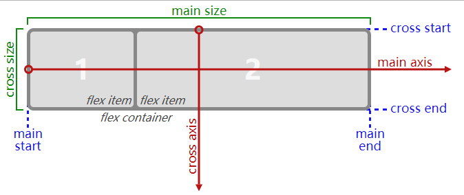
Recall that setting a flex container as a row places the flex items side-by-side from left-to-right. A flex container set as a column places the flex items in a vertical stack from top-to-bottom. For each, the direction the flex items are arranged is called the main axis. For a row, this is a horizontal line that cuts through each item. And for a column, the main axis is a vertical line through the items.
There are several options for how to space the flex items along the line that is the main axis. One of the most commonly used is justify-content: center;, which aligns all the flex items to the center inside the flex container. Others options include:
flex-start: aligns items to the start of the flex container. For a row, this pushes the items to the left of the container. For a column, this pushes the items to the top of the container. This is the default alignment if nojustify-contentis specified.flex-end: aligns items to the end of the flex container. For a row, this pushes the items to the right of the container. For a column, this pushes the items to the bottom of the container.space-between: aligns items to the center of the main axis, with extra space placed between the items. The first and last items are pushed to the very edge of the flex container. For example, in a row the first item is against the left side of the container, the last item is against the right side of the container, then the remaining space is distributed evenly among the other items.space-around: similar tospace-betweenbut the first and last items are not locked to the edges of the container, the space is distributed around all the items with a half space on either end of the flex container.space-evenly: Distributes space evenly between the flex items with a full space at either end of the flex container
An example helps show this property in action. Add the CSS property justify-content to the #box-container element, and give it a value of center.
Bonus
Try the other options for the justify-content property in the code editor to see their differences. But note that a value of center is the only one that will pass this challenge.
换上上面提到的几个属性,都可以操作,体会实际效果~
from:
to:

原文链接:https://www.cnblogs.com/jane-panyiyun/p/12008343.html
如有疑问请与原作者联系
标签:
版权申明:本站文章部分自网络,如有侵权,请联系:west999com@outlook.com
特别注意:本站所有转载文章言论不代表本站观点,本站所提供的摄影照片,插画,设计作品,如需使用,请与原作者联系,版权归原作者所有

- 利用vertical-align属性实现分隔符 2020-04-03
- 简单理解vertical-align属性和基线 2020-04-03
- 弹性盒模型 2020-04-02
- FCC---CSS Flexbox: Apply the flex-direction Property to 2019-12-08
- FCC---CSS Flexbox: Apply the flex-direction Property to 2019-12-08
IDC资讯: 主机资讯 注册资讯 托管资讯 vps资讯 网站建设
网站运营: 建站经验 策划盈利 搜索优化 网站推广 免费资源
网络编程: Asp.Net编程 Asp编程 Php编程 Xml编程 Access Mssql Mysql 其它
服务器技术: Web服务器 Ftp服务器 Mail服务器 Dns服务器 安全防护
软件技巧: 其它软件 Word Excel Powerpoint Ghost Vista QQ空间 QQ FlashGet 迅雷
网页制作: FrontPages Dreamweaver Javascript css photoshop fireworks Flash
