
css3基础-动画案例(没啥实用性,纯粹好玩的)
2019-12-30 08:43:39来源:博客园 阅读 ()

css3基础-动画案例(没啥实用性,纯粹好玩的)
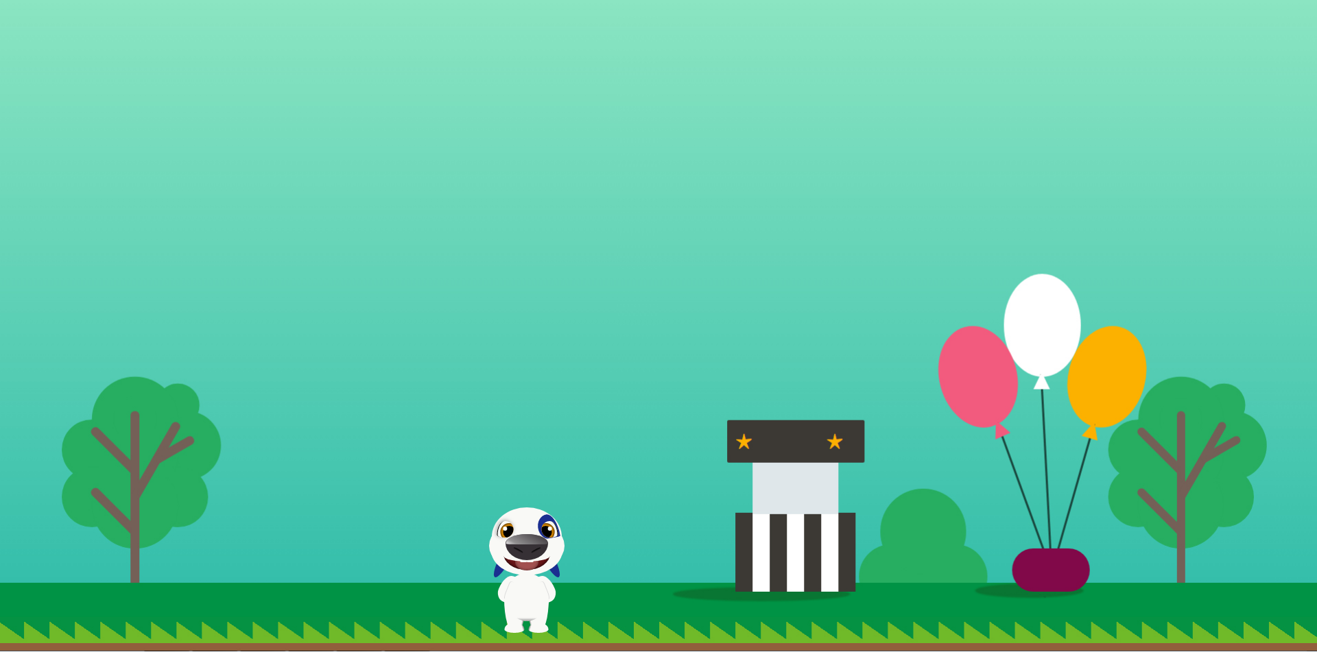
会动的汉克狗:
<!doctype html>
<html lang="en">

<head>
    <meta charset="UTF-8">
    <title>Cartoon Dog</title>
</head>

<body>
    <div class="dog">
        <div class="head">
            <div class="forehead"></div>
            <div class="face"></div>
            <div class="chin"></div>
            <div class="eye">
                <div class="pupil"></div>
            </div>
            <div class="eye right">
                <div class="pupil"></div>
            </div>
            <div class="birthmark"></div>
            <div class="ear"></div>
            <div class="ear right"></div>
            <div class="nose">
                <div class="nostril"></div>
                <div class="nostril right"></div>
            </div>
            <div class="mouth">
                <div class="teen no11"></div>
                <div class="teen no21"></div>
                <div class="tongue"></div>
            </div>
        </div>
        <div class="body">
            <div class="arm"></div>
            <div class="arm right"></div>
            <div class="leg">
                <div class="foot"></div>
            </div>
            <div class="leg right">
                <div class="foot"></div>
            </div>
            <div class="belly"></div>
        </div>
    </div>
    <style>
    :root {
        --bg: rgb(249, 249, 246);
        --hl: rgb(27, 47, 144);
        --t: 2s;
    }

    body {
        background: url(img/bg.jpg) no-repeat;
        background-size: 100%;
        overflow: hidden;
    }

    .dog {
        position: relative;
        top: 78vh;
        left: -10vw;
        /*transform: scale(1, 1);*/
    }

    .head {
        width: 275px;
        height: 275px;
        position: relative;
        margin: 0 auto;
    }

    .ear {
        animation: rotate var(--t) ease-out infinite;
        position: absolute;
        left: 50%;
        margin-left: -38px;
        top: 14px;
        z-index: 0;
        background-color: var(--hl);
        width: 16px;
        height: 70px;
        border-radius: 50%;
    }

    .ear.right {
        animation: rotate-right var(--t) ease-out infinite;
        transform: scale(-1, 1);
        margin-left: 22px;
    }

    .forehead {
        left: 50%;
        transform: translate(-50%, 0);
        top: -22px;
        border-radius: 51px / 43px 43px 5px 5px;
        width: 102px;
        height: 48px;
        background: var(--bg);
        position: absolute;
        z-index: 1
    }

    .face {
        left: 50%;
        transform: translate(-50%, 0);
        width: 110px;
        height: 68px;
        position: absolute;
        background: var(--bg);
        z-index: 1;
        border-radius: 40% / 50%;
    }

    .chin {
        left: 50%;
        transform: translate(-50%, 0);
        width: 104px;
        height: 36px;
        position: absolute;
        background: var(--bg);
        z-index: 1;
        border-radius: 50% / 0 0 36px 36px;
        top: 41px;
    }

    .eye {
        overflow: hidden;
        box-shadow: 2px 0px 0px -1px #000 inset, -1px -1px 7px 1px #bbb;
        left: 50%;
        transform: translate(-43.5px, 0);
        width: 24px;
        height: 24px;
        position: absolute;
        background: var(--bg);
        z-index: 2;
        border-radius: 50% / 20px 12px 12px 4px;
        top: -2px;
    }

    .eye.right {
        box-shadow: 2px 0px 0px -1px #000 inset;
        transform: scale(-1, 1) translate(-21.5px, 0);
    }

    .birthmark {
        left: 50%;
        transform: rotate(-10deg) translate(16.5px, 0);
        width: 30px;
        height: 36px;
        position: absolute;
        background: var(--hl);
        z-index: 2;
        border-radius: 50% / 18px 34px 2px 18px;
        top: -9px;
        z-index: 1
    }

    .birthmark:after {
        content: '';
        width: 100%;
        height: 2px;
        background: var(--bg);
        border-radius: 2px 2px 0 0;
        position: absolute;
        bottom: -1px;
        left: 1px
    }

    .nose {
        left: 50%;
        transform: translate(-50%, 0);
        width: 62px;
        height: 38px;
        position: absolute;
        background: #363035;
        z-index: 2;
        border-radius: 50% / 35% 35% 65% 65%;
        top: 17px
    }

    .nose:before {
        content: '';
        width: 98%;
        height: 40%;
        left: 50%;
        transform: translate(-50%, 0);
        position: absolute;
        background: linear-gradient(30deg, #fff 0%, #fff 5%, #aaa 20%, #363035 100%);
        border-radius: 50% / 90% 90% 10% 10%;
        opacity: 0.8
    }

    .mouth {
        animation: close var(--t) ease-out infinite;
        box-shadow: 0 0 6px 0 #000 inset;
        left: 50%;
        transform: translate(-50%, 0);
        width: 68px;
        height: 27px;
        position: absolute;
        background: #671316;
        z-index: 1;
        border-radius: 50% / 0 0 100% 100%;
        top: 45px
    }

    .mouth:before {
        content: '';
        z-index: 3;
        width: 100%;
        height: 50%;
        left: 50%;
        transform: translate(-50%, 0);
        position: absolute;
        background: var(--bg);
        border-radius: 50% / 0 0 70% 70%
    }

    .pupil {
        animation: tranlate var(--t) ease-out infinite;
        box-shadow: 0 0 6px 0 #000 inset;
        width: 26px;
        height: 26px;
        border-radius: 50%;
        background: #e79101;
        position: absolute;
        left: 3px;
        top: 3px
    }

    .pupil:before {
        border-radius: 50%;
        content: '';
        width: 18px;
        height: 18px;
        position: absolute;
        left: 50%;
        top: 50%;
        transform: translate(-50%, -50%);
        background: #000
    }

    .pupil:after {
        border-radius: 50%;
        content: '';
        width: 6px;
        height: 6px;
        position: absolute;
        left: 27%;
        top: 30%;
        transform: translate(-50%, -50%);
        background: #fff
    }

    .nostril {
        animation: resize var(--t) ease-out infinite;
        position: absolute;
        left: 50%;
        transform: translate(-20px, 0) rotate(28deg);
        top: 22px;
        z-index: 0;
        background: linear-gradient(0deg, #363035 0%, #000 100%);
        width: 15px;
        height: 4px;
        border-radius: 50%;
    }

    .nostril.right {
        transform: scale(-1, 1) translate(-6px, 0) rotate(28deg)
    }

    .teen {
        animation: follow var(--t) ease-out infinite;
        border-radius: 0 0 1px 2px;
        transform: translate(-50%, 0);
        width: 10px;
        height: 3px;
        background: var(--bg);
        position: absolute;
        top: 12px;
        left: 43%;
        z-index: 2
    }

    .teen.no21 {
        transform: scale(-1, 1) translate(-50%, 0)
    }

    .tongue {
        animation: extend var(--t) ease-out infinite;
        box-shadow: 0 0 6px 0 rgba(0, 0, 0, 0.5) inset;
        width: 34px;
        height: 18px;
        border-radius: 50% / 0 0 50% 50%;
        transform: translate(-50%, 0);
        position: absolute;
        left: 50%;
        z-index: 1;
        background: #a2504f
    }

    .body {
        width: 66px;
        height: 70px;
        position: absolute;
        left: 50%;
        transform: translate(-50%, 0);
        background: var(--bg);
        border-radius: 50%;
        top: 74px;
    }

    .arm {
        width: 26px;
        height: 40px;
        position: absolute;
        left: 50%;
        transform: translate(-40px, 0) rotate(22deg);
        background: var(--bg);
        border-radius: 50% / 25px 0 0 15px;
        top: 3px;
    }

    .arm.right {
        transform: scale(-1, 1) translate(-14px, 0) rotate(22deg);
    }

    .arm:before {
        content: '';
        width: 6px;
        height: 28px;
        box-shadow: -1px 0 0 0px #ddd;
        position: absolute;
        right: 8px;
        top: 8px;
        border-radius: 6px / 8px 0 0 20px
    }

    .leg {
        width: 29px;
        height: 50px;
        position: absolute;
        left: 50%;
        transform: translate(-33px, 0);
        background: linear-gradient(-80deg, #000 0%, var(--bg) 17%, var(--bg) 100%);
        border-radius: 50% / 0px 25px 25px 50px;
        top: 37px;
    }

    .leg.right {
        transform: scale(-1, 1) translate(-3px, 0)
    }

    .foot {
        width: 29px;
        height: 15px;
        position: absolute;
        left: 50%;
        transform: translate(-50%, 0);
        background: linear-gradient(-107deg, #000 0%, var(--bg) 17%, var(--bg) 100%);
        border-radius: 50% / 10px 10px 5px 5px;
        bottom: 0px;
    }

    .belly {
        width: 60px;
        height: 36px;
        position: absolute;
        left: 50%;
        transform: translate(-50%, 0);
        background: linear-gradient(0deg, #999 0%, var(--bg) 14%, var(--bg) 100%);
        border-radius: 50% / 0 0 36px 36px;
        bottom: 0px;
    }

    @keyframes rotate {
        0% {
            transform: rotate(0deg)
        }

        ,
        5% {
            transform: rotate(0deg)
        }

        55% {
            transform: rotate(30deg)
        }

        100% {
            transform: rotate(0deg)
        }

    }

    @keyframes rotate-right {
        0% {
            transform: rotate(0deg)
        }

        ,
        5% {
            transform: rotate(0deg)
        }

        55% {
            transform: rotate(-30deg)
        }

        100% {
            transform: rotate(0deg)
        }

    }

    @keyframes tranlate {
        0% {
            transform: translate(0px, 0)
        }

        ,
        5% {
            transform: translate(0px, 0)
        }

        55% {
            transform: translate(2px, 0)
        }

        100% {
            transform: translate(0px, 0)
        }
    }

    @keyframes resize {
        0% {
            height: 4px
        }

        ,
        5% {
            height: 4px
        }

        55% {
            height: 3px
        }

        100% {
            height: 4px
        }
    }

    @keyframes extend {
        0% {
            height: 18px
        }

        ,
        5% {
            height: 18px
        }

        55% {
            height: 25px
        }

        100% {
            height: 18px
        }
    }

    @keyframes close {
        0% {
            height: 27px
        }

        ,
        5% {
            height: 27px
        }

        55% {
            height: 24px
        }

        100% {
            height: 27px
        }
    }

    @keyframes follow {
        0% {
            top: 12px
        }

        ,
        5% {
            top: 12px
        }

        55% {
            top: 10px
        }

        100% {
            top: 12px
        }
    }
    </style>
</body>

</html>
小兔子动画:
<!DOCTYPE html>
<html lang="en">
<head>
    <meta charset="UTF-8">
    <title>index</title>
    <link rel="stylesheet" href="css/index.css">
</head>
<body>
    <!-- 天空 -->
    <div class="sky">
        <!-- 云 -->
        <div id="cloud1" class="cloud"></div>
        <div id="cloud2" class="cloud"></div>
        <div id="cloud3" class="cloud"></div>
        <div id="cloud4" class="cloud"></div>
        <div id="cloud5" class="cloud"></div>
    </div>
    <!-- 草地 -->
    <div class="grass">
        <img class="rabbit" src="img/rabbit.png" alt="rabbit">
    </div>
</body>
</html>
Index.css
*{margin:0;padding:0;}
html,body{width:100%;height:100%;overflow: hidden;}
.sky{
    width:100%;
    height:60%;
    position: relative;
    background: -webkit-linear-gradient(0deg, rgba(196, 228, 253,0), rgba(196, 228, 253,0.8));
    background:    -moz-linear-gradient(0deg, rgba(196, 228, 253,0), rgba(196, 228, 253,0.8));
    background:      -o-linear-gradient(0deg, rgba(196, 228, 253,0), rgba(196, 228, 253,0.8));
    background:         linear-gradient(0deg, rgba(196, 228, 253,0), rgba(196, 228, 253,0.8));
}
.grass{
    width:100%;
    height:40%;
    position: relative;
    background: -webkit-linear-gradient(0deg, rgba(148, 190, 89,0.8), rgba(148, 190, 89,0));
    background:    -moz-linear-gradient(0deg, rgba(148, 190, 89,0.8), rgba(148, 190, 89,0));
    background:      -o-linear-gradient(0deg, rgba(148, 190, 89,0.8), rgba(148, 190, 89,0));
    background:         linear-gradient(0deg, rgba(148, 190, 89,0.8), rgba(148, 190, 89,0));
}
/*云的统一样式*/
.cloud{
    position: absolute;
    background-color: #fff;
    border-radius: 50%;
    width: 100px;
    height: 103px;
    opacity: 0.5;
    z-index: 1;
}
.cloud:before{
    content: '';
    transform: translate(-50%, 0);
    position: absolute;
    left: -49%;
    top: 8px;
    border-radius: 43px;
    background-color: #fff;
    width: 65px;
    height: 103px;
    z-index: 4;
    transform: rotate(-30deg);
}
.cloud:after{
    content: '';
    transform: translate(-50%, 0);
    width: 221%;
    height: 62px;
    border-radius: 52px;
    background-color: #fff;
    position: absolute;
    top: 28px;
    left: 25px;
    z-index: 3;
}
/*每一朵云的单独样式*/
#cloud1{opacity: 0.5;left: 51%;top: 22px;z-index:10;
        animation: cloud_move 15s ease-out infinite;}
#cloud2{opacity: 0.7;left: 11%;top: 85px;z-index:30;
        animation: cloud_move 18s ease-out infinite;}
#cloud3{opacity: 0.8;left: 41%;top: 104px;z-index:50;
        animation: cloud_move 12s ease-out infinite;}
#cloud4{opacity: 0.6;left: 71%;top: 78px;z-index:20;
        animation: cloud_move 26s ease-out infinite;}
#cloud5{opacity: 0.9;left: 91%;top: 138px;z-index:40;
        animation: cloud_move 40s ease-out infinite;}
/*云朵动画*/
@keyframes cloud_move {
    0% {left: 110%;}
    100% {left: -10%;}
}
.rabbit{position: absolute;bottom:50px;right:200px;width:300px;}

自定义属性必须遵循CSS级联规则,使用:root 作用域来定义全局变量,由于自定义属性是全局的,为了避免冲突,最好按照统一的约定来命名变量,如果想让某个变量只在部分元素/组件下可见,只需要在特定的元素下定义该变量,并且自定义全局属性,为了避免冲突,可以简单的遵循BEM命名法来形成”命名空间”
body {
  --foo: #7F583F;
  --bar: #F7EFD2;
}
a {
  color: var(--foo);
  text-decoration-color: var(--bar);
}
原文链接:https://www.cnblogs.com/chenyingying0/p/12120397.html
如有疑问请与原作者联系
标签:
版权申明:本站文章部分自网络,如有侵权,请联系:west999com@outlook.com
特别注意:本站所有转载文章言论不代表本站观点,本站所提供的摄影照片,插画,设计作品,如需使用,请与原作者联系,版权归原作者所有

- css与javascript重难点,学前端,基础不好一切白费! 2020-06-11
- ie8下透明度处理 2020-06-11
- HTML基础教程_1 2020-06-09
- HTML基础02 2020-06-09
- HTML基础01 2020-06-07
IDC资讯: 主机资讯 注册资讯 托管资讯 vps资讯 网站建设
网站运营: 建站经验 策划盈利 搜索优化 网站推广 免费资源
网络编程: Asp.Net编程 Asp编程 Php编程 Xml编程 Access Mssql Mysql 其它
服务器技术: Web服务器 Ftp服务器 Mail服务器 Dns服务器 安全防护
软件技巧: 其它软件 Word Excel Powerpoint Ghost Vista QQ空间 QQ FlashGet 迅雷
网页制作: FrontPages Dreamweaver Javascript css photoshop fireworks Flash
