
flex布局实例--实现底部导航
2020-03-14 16:03:42来源:博客园 阅读 ()

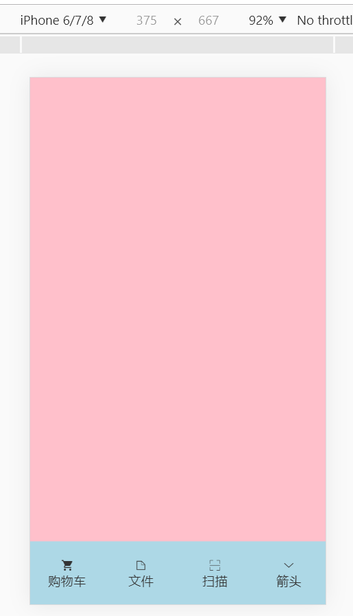
flex布局实例--实现底部导航
vh 存在兼容性问题,不建议使用
<!DOCTYPE html>
<html lang="en">
<head>
    <meta charset="UTF-8">
    <meta name="viewport" content="width=device-width,initial-scale=1,user-scalable=no,maximum-scale=1,minimum-scale=1">
    <title>Document</title>
    <link rel="stylesheet" href="font/iconfont.css">
    <style>
        *{margin:0;padding:0;box-sizing:border-box;}
        body{background-color: pink;}
        ul{list-style: none;}
        a{text-decoration: none;color:#333;}
        .footer{width:100%;height:80px;position: fixed;background:lightblue;bottom:0;display: flex;}
        .footer li{flex:1;/*平分空间*/}
        .footer li a{height:100%;display: flex;flex-direction:column;justify-content: center;/*水平居中*/align-items:center;/*垂直居中*/}
    </style>
</head>
<body>
    <ul class="footer">
        <li>
            <a href="#">
                <i class="iconfont icon-gouwuche"></i>
                <span>购物车</span>
            </a>
        </li>
        <li>
            <a href="#">
                <i class="iconfont icon-file"></i>
                <span>文件</span>
            </a>
        </li>
        <li>
            <a href="#">
                <i class="iconfont icon-saomiao"></i>
                <span>扫描</span>
            </a>
        </li>
        <li>
            <a href="#">
                <i class="iconfont icon-xialajiantou"></i>
                <span>箭头</span>
            </a>
        </li>
    </ul>
</body>
</html>
卡片排列实例
<!DOCTYPE html>
<html lang="en">
<head>
    <meta charset="UTF-8">
    <meta name="viewport" content="width=device-width,initial-scale=1,user-scalable=no,maximum-scale=1,minimum-scale=1">
    <title>Document</title>
    <link rel="stylesheet" href="font/iconfont.css">
    <style>
        *{margin:0;padding:0;box-sizing:border-box;}
        body{background-color: pink;font-size:12px;}
        ul{list-style: none;}
        a{text-decoration: none;color:#333;}
        .container{width:100%;padding:20px;display: flex;flex-wrap:wrap;justify-content: space-around;}
        .item{width:45%;height:130px;background:lightblue;border-radius:5px;margin-bottom:20px;display: flex;justify-content: space-around;}
        .left{display: flex;flex-direction:column;justify-content:space-around;}
        .right{display: flex;align-items:center;}
        button{background-color: orange;color:#fff;padding:10px;border:0;border-radius:5px;}
    </style>
</head>
<body>
    <div class="container">
        <div class="item">
            <div class="left">
                <p>前端小白入门手册</p>
                <p>适用人群:没有任何前端基础的小白</p>
                <p>费用:¥999</p>
            </div>
            <div class="right"><button>加入购物车</button></div>
        </div>
        <div class="item">
            <div class="left">
                <p>前端小白入门手册</p>
                <p>适用人群:没有任何前端基础的小白</p>
                <p>费用:¥999</p>
            </div>
            <div class="right"><button>加入购物车</button></div>
        </div>
        <div class="item">
            <div class="left">
                <p>前端小白入门手册</p>
                <p>适用人群:没有任何前端基础的小白</p>
                <p>费用:¥999</p>
            </div>
            <div class="right"><button>加入购物车</button></div>
        </div>
        <div class="item">
            <div class="left">
                <p>前端小白入门手册</p>
                <p>适用人群:没有任何前端基础的小白</p>
                <p>费用:¥999</p>
            </div>
            <div class="right"><button>加入购物车</button></div>
        </div>
    </div>
</body>
</html>

原文链接:https://www.cnblogs.com/chenyingying0/p/12492957.html
如有疑问请与原作者联系
标签:
版权申明:本站文章部分自网络,如有侵权,请联系:west999com@outlook.com
特别注意:本站所有转载文章言论不代表本站观点,本站所提供的摄影照片,插画,设计作品,如需使用,请与原作者联系,版权归原作者所有

- DIV居中的经典方法 2020-06-13
- CSS Grid 布局 2020-06-01
- HTML开发实例-简单相亲网站开发(主体为table) 2020-05-27
- 构建一个杂志布局(译文) 2020-05-14
- 【2020Python修炼记】前端开发之 CSS基础布局 2020-05-13
IDC资讯: 主机资讯 注册资讯 托管资讯 vps资讯 网站建设
网站运营: 建站经验 策划盈利 搜索优化 网站推广 免费资源
网络编程: Asp.Net编程 Asp编程 Php编程 Xml编程 Access Mssql Mysql 其它
服务器技术: Web服务器 Ftp服务器 Mail服务器 Dns服务器 安全防护
软件技巧: 其它软件 Word Excel Powerpoint Ghost Vista QQ空间 QQ FlashGet 迅雷
网页制作: FrontPages Dreamweaver Javascript css photoshop fireworks Flash
