
移动端常见问题(H5兼容性+JS兼容性+css3兼容性…
2020-03-17 16:01:36来源:博客园 阅读 ()

移动端常见问题(H5兼容性+JS兼容性+css3兼容性)
h5 浏览器兼容性问题:
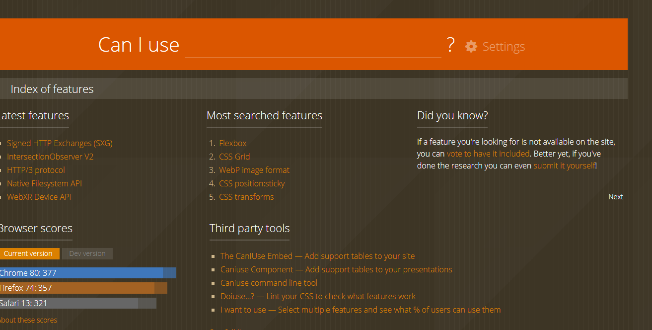
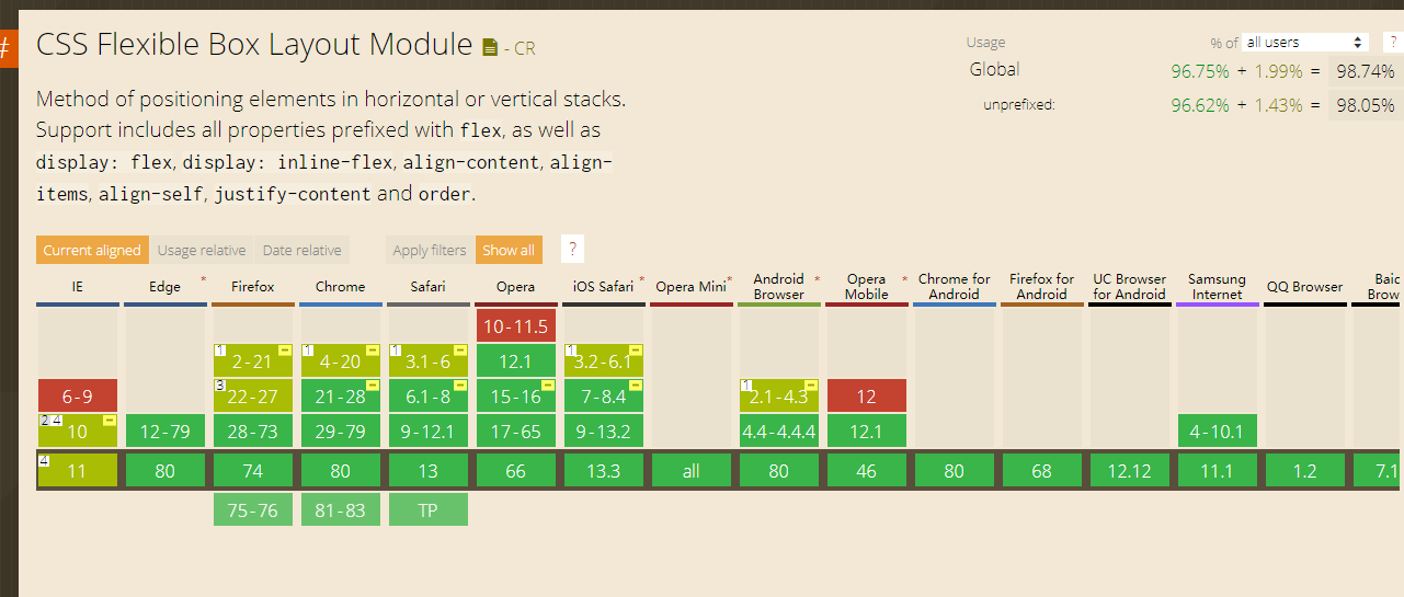
浏览器兼容性情况可以在这个网站查询 https://caniuse.com/
绿色代表完全支持,黄色代表部分支持,红色代表不支持
右上角的黄色小短杠表示要加一些厂商前缀
兼容性测试:
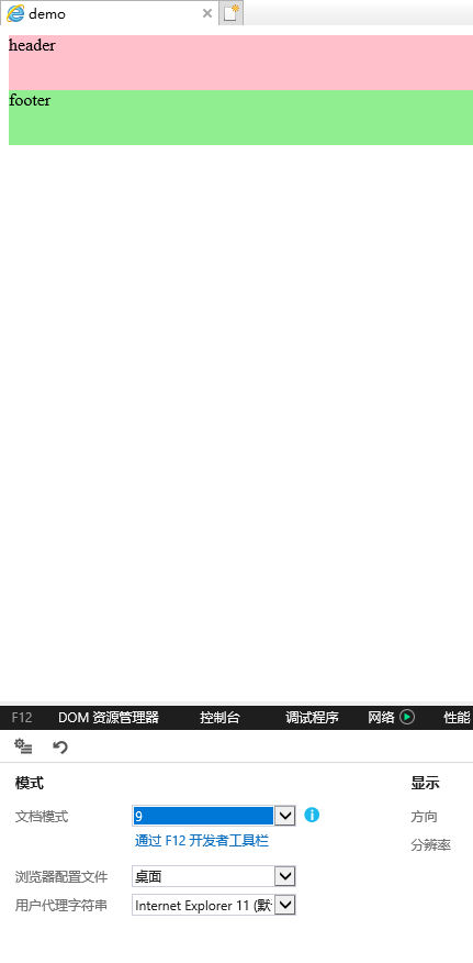
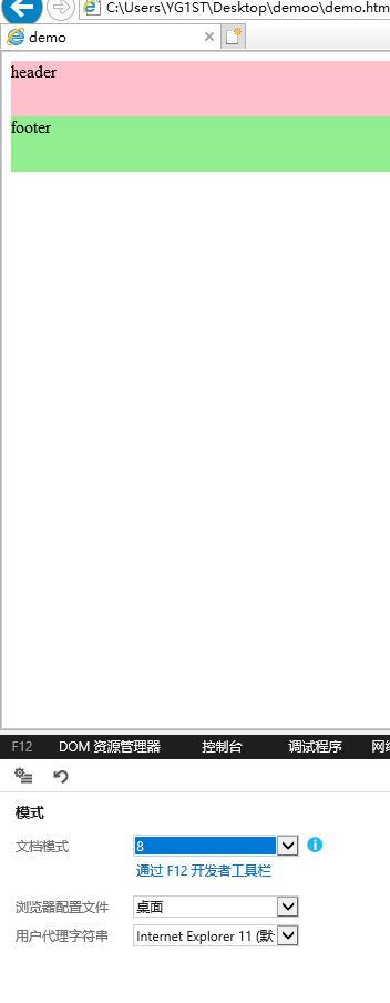
<!DOCTYPE html>
<html lang="en">
<head>
    <meta charset="UTF-8">
    <title>demo</title>
    <meta name="viewport" content="width=device-width, initial-scale=1, maximum-scale=1, minimum-scale=1, user-scalable=no">
    <style>
        header,footer{
            width:100%;
            height:50px;
        }
        header{
            background:pink;
        }
        footer{
            background:lightgreen;
        }
    </style>
</head>
<body>
    <header>header</header>
    <footer>footer</footer>
</body>
</html>
IE9-11
IE8-
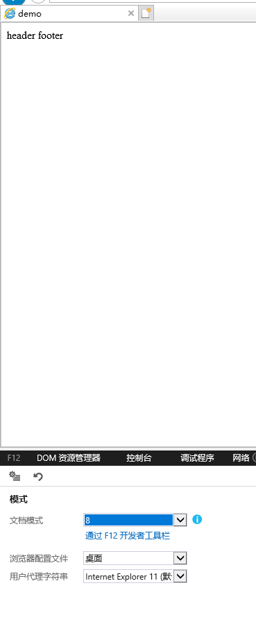
解决方法:引入html5shiv https://www.bootcdn.cn/html5shiv/
<!DOCTYPE html>
<html lang="en">
<head>
    <meta charset="UTF-8">
    <title>demo</title>
    <meta name="viewport" content="width=device-width, initial-scale=1, maximum-scale=1, minimum-scale=1, user-scalable=no">
    <style>
        header,footer{
            width:100%;
            height:50px;
        }
        header{
            background:pink;
        }
        footer{
            background:lightgreen;
        }
    </style>
    <script src="https://cdn.bootcss.com/html5shiv/3.7.3/html5shiv-printshiv.js"></script>
</head>
<body>
    <header>header</header>
    <footer>footer</footer>
</body>
</html>
JS浏览器兼容性:
错误写法:
<script>
        if(requestAnimationFrame){
            //...
        }
    </script>
因为如果属性不存在,则表示调用了未声明的变量,会导致报错
正确写法:
<script>
        if(window.requestAnimationFrame){
            //...
        }
    </script>
如果不存在,则调用的是未定义的属性,并不会报错
但是这种判断并不周全,因为有些浏览器是支持的,但是可能需要厂商前缀
比较严谨的写法:
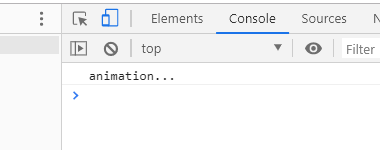
<!DOCTYPE html>
<html lang="en">
<head>
    <meta charset="UTF-8">
    <title>demo</title>
    <meta name="viewport" content="width=device-width, initial-scale=1, maximum-scale=1, minimum-scale=1, user-scalable=no">
    <style>
        header,footer{
            width:100%;
            height:50px;
        }
        header{
            background:pink;
        }
        footer{
            background:lightgreen;
        }
    </style>
    <script src="https://cdn.bootcss.com/html5shiv/3.7.3/html5shiv-printshiv.js"></script>
</head>
<body>
    <header>header</header>
    <footer>footer</footer>

    <script>
        var requestAnimationFrame=window.requestAnimationFrame ||
        window.webkitRequestAnimationFrame ||
        window.moxRequestAnimationFrame ||
        window.msRequestAnimationFrame ||
        window.oRequestAnimationFrame ||
        //requestAnimationFrame跟setTimeout很类似,浏览器不支持时可以自己写一个类似效果的函数
        function(fn){
            setTimeout(fn,16);
        };

        requestAnimationFrame(function(){
            console.log("animation...");
        })
    </script>
</body>
</html>
css3浏览器兼容性:
通过编辑器插件,自动补全厂商前缀
或者使用工程化手段自动添加
在vscode中安装插件 :
1、扩展输入Autoprefixer,点击安装,然后点击重新加载
2、打开设置->搜索autoprefixer->点击在setting.json里编辑
3、加入这段代码:
"autoprefixer.browsers": [
    "last 0 versions",
    "> 5%"
]
4、在需要添加前缀的css文件上,右键点击命令面板,输入Autoprefixer CSS就好啦
如何兼容IE:
进入 https://modernizr.com/
点击download
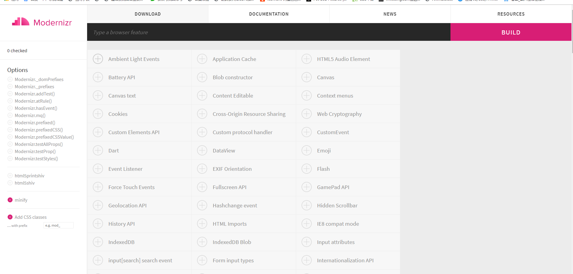
搜索你需要检测的特性,点击+号(检测所有特性太庞大,没有必要)
然后点击build-download

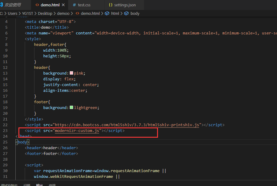
在文件中引入刚才下载的js文件
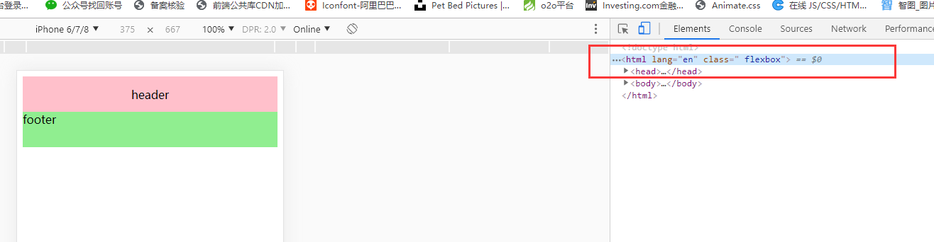
你会发现在支持flex属性的浏览器上,html添加了flexbox的类名:
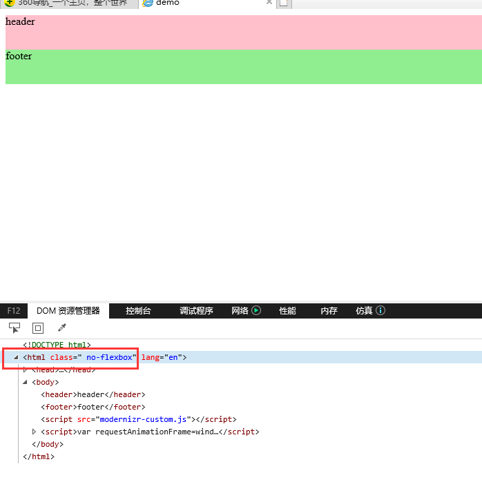
而在不支持的浏览器上,html添加了no-flexbox的类名:
这样就可以分开写兼容状态和不兼容状态的样式:
别忘了在vscode中按住ctrl+shift+p,输入autoprefixer:run,添加厂商前缀
header,footer{
    width:100%;
    height:50px;
}
header{
    background:pink;
}
/* 兼容flex */
.flexbox header{
    display: -webkit-box;
    display: flex;
    -webkit-box-pack: center;
            justify-content: center;
    -webkit-box-align:center;
            align-items:center;
}
/* 不兼容flex */
.no-flexbox header{
    text-align:center;
    line-height: 50px;
}
footer{
    background:lightgreen;
}
原文链接:https://www.cnblogs.com/chenyingying0/p/12509922.html
如有疑问请与原作者联系
标签:
版权申明:本站文章部分自网络,如有侵权,请联系:west999com@outlook.com
特别注意:本站所有转载文章言论不代表本站观点,本站所提供的摄影照片,插画,设计作品,如需使用,请与原作者联系,版权归原作者所有

上一篇:移动端适配-动态计算rem
下一篇:超大分辨率屏幕适配方案
- 取消a标签在移动端点击时的背景颜色 2020-03-19
- css3文字特效和浏览器兼容性 2020-03-18
- 移动端性能优化(HTML性能优化) 2020-03-17
- 移动端常见问题(动画演示) 2020-03-17
- 移动端常见问题(click 300ms延迟) 2020-03-17
IDC资讯: 主机资讯 注册资讯 托管资讯 vps资讯 网站建设
网站运营: 建站经验 策划盈利 搜索优化 网站推广 免费资源
网络编程: Asp.Net编程 Asp编程 Php编程 Xml编程 Access Mssql Mysql 其它
服务器技术: Web服务器 Ftp服务器 Mail服务器 Dns服务器 安全防护
软件技巧: 其它软件 Word Excel Powerpoint Ghost Vista QQ空间 QQ FlashGet 迅雷
网页制作: FrontPages Dreamweaver Javascript css photoshop fireworks Flash
