
HTML连载76-正方体和长方体
2020-03-20 16:00:50来源:博客园 阅读 ()
 HTML连载76-正方体和长方体
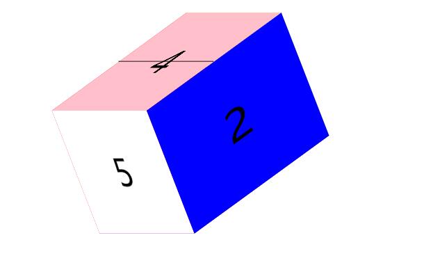
一、如何编辑出一个正方体
上后下前的顺序编写,最后在写左右
<!DOCTYPE html>

<html lang="en">

<head>

    <meta charset="UTF-8">

    <title>D184_3DTransformCube</title>

    <style>

        *{

            margin:0;

            padding:0;

        }

        ul{

            width: 200px;

            height: 200px;

            border: 1px solid black;

            box-sizing:border-box;

            margin:100px auto;

            position:relative;

            transform: rotateY(0deg) rotateX(0deg);

            transform-style: preserve-3d;/*转换成一个3D的面*/

?

        }

        li{

            list-style: none;

            width: 200px;

            height: 200px;

            text-align:center;

            line-height:200px;

            font-size:60px;

            position:absolute;

        }

        ul li:nth-child(1){

            background-color: red;

            transform:rotateX(90deg) translateZ(100px) ;

?

        }

        ul li:nth-child(2){

            background-color: blue;

            transform:rotateX(180deg) translateZ(100px) ;

        }

        ul li:nth-child(3){

            background-color: purple;

            transform:rotateX(270deg) translateZ(100px) ;

        }

        ul li:nth-child(4){

            background-color: pink;

            transform:rotateX(360deg) translateZ(100px) ;

        }

        ul li:nth-child(5){

            background-color: white;

        }

        ul li:nth-child(6){

            background-color: yellow;

        }

</style>

</head>

<body>

<ul>

    <!--这里的六个li代表的就是正方体的六个面-->

    <li>1</li>

    <li>2</li>

    <li>3</li>

    <li>4</li>

    <li>5</li>

    <li>6</li>

</ul>

</body>

</html>

二、如何编辑出一个长方体
?要点:我们可以在正方体的基础上,利用属性tranform:scale(水平倍数,垂直倍数)的方式进行扩展,直接举个例子
<!DOCTYPE html>

<html lang="en">

<head>

    <meta charset="UTF-8">

    <title>D185_Cubiod</title>

    <style>

        *{

            margin:0;

            padding:0;

        }

        ul{

            width: 200px;

            height: 200px;

            border: 1px solid black;

            box-sizing:border-box;

            margin:100px auto;

            position:relative;

            transform: rotateY(0deg) rotateX(0deg);

            transform-style: preserve-3d;/*转换成一个3D的面*/

?

        }

        li{

            list-style: none;

            width: 200px;

            height: 200px;

            text-align:center;

            line-height:200px;

            font-size:60px;

            position:absolute;

        }

        ul li:nth-child(1){

            background-color: red;

            transform:translate(-100px) rotateY(-90deg) scale(1.5,1);

?

?

        }

        ul li:nth-child(2){

            background-color: blue;

            transform:translate(100px) rotateY(90deg) scale(1.5,1);

        }

        ul li:nth-child(3){

            background-color: purple;

            transform:translateY(100px) rotateX(-90deg) scale(1,1.5);

        }

        ul li:nth-child(4){

            background-color: pink;

            transform:translateY(-100px) rotateX(90deg) scale(1,1.5);

        }

        ul li:nth-child(5){

            background-color: white;

            transform:translateZ(150px) rotateX(0deg);

        }

        ul li:nth-child(6){

            background-color: yellow;

            transform:translateZ(-150px) rotateX(-180deg);

        }

</style>

</head>

<body>

<ul>

    <!--这里的六个li代表的就是正方体的六个面-->

    <li>1</li>

    <li>2</li>

    <li>3</li>

    <li>4</li>

    <li>5</li>

    <li>6</li>

</ul>

</body>

</html>
三、源码:
D184_3DTransformCube.html
D185_Cubiod.html
地址:
https://github.com/ruigege66/HTML_learning/blob/master/D184_3DTransformCube.html
https://github.com/ruigege66/HTML_learning/blob/master/D185_Cubiod.html
2.CSDN:https://blog.csdn.net/weixin_44630050
3.博客园:https://www.cnblogs.com/ruigege0000/
4.欢迎关注微信公众号:傅里叶变换,个人账号,仅用于技术交流,后台回复“礼包”获取Java大数据学习视频礼包

原文链接:https://www.cnblogs.com/ruigege0000/p/12528534.html
如有疑问请与原作者联系
标签:
版权申明:本站文章部分自网络,如有侵权,请联系:west999com@outlook.com
特别注意:本站所有转载文章言论不代表本站观点,本站所提供的摄影照片,插画,设计作品,如需使用,请与原作者联系,版权归原作者所有

- DIV居中的经典方法 2020-06-13
- Html/css 列表项 区分列表首尾 2020-06-11
- HTML骨架 2020-06-10
- HTML基础教程_1 2020-06-09
- HTML基础02 2020-06-09
IDC资讯: 主机资讯 注册资讯 托管资讯 vps资讯 网站建设
网站运营: 建站经验 策划盈利 搜索优化 网站推广 免费资源
网络编程: Asp.Net编程 Asp编程 Php编程 Xml编程 Access Mssql Mysql 其它
服务器技术: Web服务器 Ftp服务器 Mail服务器 Dns服务器 安全防护
软件技巧: 其它软件 Word Excel Powerpoint Ghost Vista QQ空间 QQ FlashGet 迅雷
网页制作: FrontPages Dreamweaver Javascript css photoshop fireworks Flash
