
值得记录的(五)- 微信小程序自定义 tabbar
2018-11-26 07:54:29来源:博客园 阅读 ()

一定的需求情况下,无法使用小程序原生的 tabbar 的时候,需要自行实现一个和 tabbar 功能一模一样的自制组件。
查阅了海量的博客和文档之后,亲自踩坑。总结了三种在不使用微信小程序原生 tabbar的情况下自制 tabbar 的方法。并说说这几种方法各自的特色。
类 navigator 跳转方式
类 navigator 跳转方式是我自己起的名称,因为它的实现思路就是这个样子的。期初参考 微信小程序自定义tabBar组件开发 这篇博文的思路。进行了这种方式的尝试,并为后续提供了解决思路。在这次实践的过程中使用了和该博文类似的目录结构。

template 文件主要包含了 tabbar 的内容、逻辑、模板、样式。
tabbar_template.js
//初始化数据
function tabbarinit() {
  return [
    {
      "current": 0,
      "pagePath": "/pages/travel_shop/travel/travel_index/travel_index",
      "iconPath": "/pages/img/tab_icon_home@2x.png",
      "selectedIconPath": "/pages/img/tab_icon_home_sel@2x.png",
      "text": "首页"
    },
    {
      "current": 0,
      "pagePath": "/pages/travel_shop/travel/travel_car/travel_car",
      "iconPath": "/pages/img/tab_icon_shop@2x.png",
      "selectedIconPath": "/pages/img/tab_icon_shop_sel@2x.png",
      "text": "购物车"
    },
    {
      "current": 0,
      "pagePath": "/pages/travel_shop/travel/travel_my/travel_my",
      "iconPath": "/pages/img/tab_icon_my@2x.png",
      "selectedIconPath": "/pages/img/tab_icon_my_sel@2x.png",
      "text": "我的"
    }
  ]

}
//tabbar 主入口
function tabbarmain(bindName = "tabdata", id, target) {
  var that = target;
  var bindData = {};
  var otabbar = tabbarinit();
  otabbar[id]['iconPath'] = otabbar[id]['selectedIconPath']   //换当前的icon
  otabbar[id]['current'] = 1;
  bindData[bindName] = otabbar
  that.setData({ bindData });
}

module.exports = {
  tabbar: tabbarmain
}
tabbar_template.wxml
<template name="tabBar">
  <view class="tabBar">
    <block wx:for="{{tabBar}}" wx:for-item="item" wx:key="tabBar">
        <view class="tabBar-item">
            <navigator open-type="reLaunch" url="{{item.pagePath}}">
                <view><image class="tabBar-icon" src='{{item.iconPath}}'></image></view>
                <view class="{{item.current== 1 ? 'tabBartext' :''}}">{{item.text}}</view>
            </navigator>
        </view>
    </block>
 </view>
</template>
tabbar_template.wxss
.tabBar-icon{
  width:54rpx;
  height: 54rpx;
}
.tabBar{
  width:100%;
  position: fixed;
  bottom:0;
  padding:10rpx;
  margin-left:-4rpx;
  background:#F7F7FA;
  font-size:24rpx;
  color:#8A8A8A;
  box-shadow: 3rpx 3rpx 3rpx 3rpx #aaa;
  z-index: 9999;
}

 .tabBar-item{
  float:left;
  width: 33.333%;
  text-align: center;
  overflow: hidden;
}
/*当前字体颜色*/
.tabBartext{
  color: black;
}
.navigator-hover{
  background-color: rgba(0, 0, 0, 0);
}
而后在全局引入样式
@import "/pages/travel_shop/travel/tabbar_template/tabbar_template.wxss";
并在每一个页面的子文件(wxml、JS)中引入相应的内容
wxml 引入
<import src="/pages/travel_shop/travel/tabbar_template/tabbar_template.wxml"/>
<template is="tabBar" data="{{tabBar:bindData.tabBar}}"/>
JS 引入
var template = require("../tabbar_template/tabbar_template.js");
并在对应的 onLoad 生命周期中,注明它是哪一个 tabbar
  onLoad: function (options) {
    template.tabbar("tabBar", 1, this) //0表示第一个tabbar,这里1表示第二个 tabbar 的 icon
  },
效果预览

我们最终得到了效果,但这种效果带了明显的抖动闪烁。原因则是因为这种实现方式的本质是通过 navigator 和 JS 事件触发实现页面之间的跳转。因此我开始找寻另一种实现的方式。在 微信小程序自定义tabBar组件开发 这篇博客的留言板,我发现该文的作者也发现了这种方式的不足,并提到可以通过可以把页面都写成组件 component 的方式实现更好的效果。
template 模板 / component 组件
在继续查阅了一些关于小程序自定义 tabbar 的博客之后,找到了 微信小程序 - 自定义tabbar 这篇博文。按照这篇博文描述的结构,我也进行了尝试。发现这种方式不会出现之前跳转产生的那种闪烁现象出现。

之后再查阅 微信小程序 template 模板与 component 组件的区别和使用 这篇博文的时候了解到,如果当我们主要是为了展示页面的时候,可以使用 template 方式。如果涉及到 tabbar 对应各个页面的业务逻辑交互比较多,那就最好使用 component 组件。
因为这三个页面涉及到了很多独立的交互,所以我决定使用 component 组件的形式,将自定义的 tabbar 写成一个页面,然后将其他三个 tabbar 按钮对应的页面写成三个 component 组件。这种方法和 Vue 中的组件化很相似,可以把单个组件文件夹当成 Vue 中的一个 .vue 文件。
component 与普通 page 类似,但是 JS 文件和 JSON 文件与页面不同。
小程序组件 JS 模板
Component({
  /* 开启全局样式使用 */
  options: {
    addGlobalClass: true,
  },

  /* 组件的属性列表 */
  properties: {
    name: {
      type: String,
      value: ''
    }
  },

  /* 组件的初始数据 */
  data: {

  },

  /* 生命周期函数 */
  lifetimes: {
    attached: function () { },
    moved: function () { },
    detached: function () { },
  },

  /* 组件的方法列表 */
  methods: {

  },
})
component 组件 JSON 文件
{
  "component": true,
  "usingComponents": {}
}
tabbar 引用和配置
引用组件 JSON
按照如图的结构,三个 component 作为子组件,tabber 作为一个父级,因此它的 JSON 需要引入这三个 component 组件。
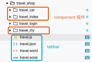
// travel.json
{
  "usingComponents": {
    "travel_car": "travel_car/travel_car",
    "travel_index": "travel_index/travel_index",
    "travel_my": "travel_my/travel_my"
  }
}
tabbar JS
而该页面的 JS 仅仅只用来控制 tabbar 的 icon 选择,和传递一个 index 告诉页面该隐藏和显示哪一个 component 组件。
// travel.js
let app = getApp()

Page({
  data: {
    currentTab: 0,
    items: [
      {
        "iconPath": "/pages/img/tab_icon_home@2x.png",
        "selectedIconPath": "/pages/img/tab_icon_home_sel@2x.png",
        "text": "首页"
      },
      {
        "iconPath": "/pages/img/tab_icon_shop@2x.png",
        "selectedIconPath": "/pages/img/tab_icon_shop_sel@2x.png",
        "text": "购物车"
      },
      {
        "iconPath": "/pages/img/tab_icon_my@2x.png",
        "selectedIconPath": "/pages/img/tab_icon_my_sel@2x.png",
        "text": "我的"
      }
    ]
  },
  //事件处理函数
  bindChange: function (e) {
    let that = this;
    that.setData({
      currentTab: e.detail.current
    });
  },
  swichNav: function (e) {
    let that = this;
    if (this.data.currentTab === e.target.dataset.current) {
      return false;
    } else {
      that.setData({
        currentTab: e.target.dataset.current
      })
    }
  },
  onLoad: function () {
    let that = this
    app.getUserInfo(function (userInfo) {
      that.setData({
        userInfo: userInfo
      })
    })
  }
})
tabbar WXML
直接使用之前 JSON 中引用过的标签名,类似于 Vue 中使用模板标签。这里由于组件模板标签不支持直接使用 hidden 属性,所以在外包裹了一层 view 标签用来添加 hidden属性。
<view hidden="{{currentTab == 0? false: true}}">
  <travel_index/>
</view>
<view hidden="{{currentTab == 1? false: true}}">
  <travel_car/>
</view>
<view hidden="{{currentTab == 2? false: true}}">
  <travel_my/>
</view>

<view class="nav-tabs">
  <view class="tab-list {{currentTab == idx ? 'active' : 'default' }}" wx:for="{{items}}" wx:key="prototype" wx:for-index="idx" wx:for-item="item" data-current="{{idx}}" bindtap="swichNav">
    <text class="tab-text" wx:for-index="idx" data-current="{{idx}}" src="{{currentTab == idx ? item.selectedIconPath : item.iconPath }}">{{item.text}}</text>
    <image class="iconPath" wx:for-index="idx" data-current="{{idx}}" src="{{currentTab == idx ? item.selectedIconPath : item.iconPath }}"></image>
  </view>
</view>
tabbar WXSS
Some selectors are not allowed in component wxss, including tag name selectors, ID selectors, and attribute selectors.(./pages/xxx/xxx.wxss:288:3)This wxss file is ignored.
造成这种报错的原因是
component组件的样式中不能包含一些特定的选择器。
page {
  display: flex;
  flex-direction: column;
  height: 100%;
}

.nav-tabs {
  width: 100%;
  display: flex;
  position: fixed;
  bottom: 0;
}

.tab-list {
  display: flex;
  align-items: center;
  justify-content: center;
  flex-direction: column-reverse;
  background: #fcfcfc;
}

.tab-text {
  font-size: 24rpx;
  line-height: 35rpx;
  color: #5f5f5f;
}

.iconPath {
  width:54rpx;
  height: 54rpx;
}

.tab-content {
  flex: 1;
}

.default {
  line-height: 75rpx;
  text-align: center;
  flex: 1;
  color: #eee;
  font-weight: bold;
  font-size: 28rpx;
}

.active {
  line-height: 75rpx;
  text-align: center;
  color: black;
  flex: 1;
  font-weight: bold;
  font-size: 28rpx;
}

.show {
  display: block;
  flex: 1;
}

.hidden {
  display: none;
  flex: 1;
}
预览效果
最终就完成了一个非原生小程序 tabbar 的自定义 tabbar 。

参考
微信小程序自定义tabBar组件开发
微信小程序 - 自定义tabbar
微信小程序 template 模板与 component 组件的区别和使用
标签:
版权申明:本站文章部分自网络,如有侵权,请联系:west999com@outlook.com
特别注意:本站所有转载文章言论不代表本站观点,本站所提供的摄影照片,插画,设计作品,如需使用,请与原作者联系,版权归原作者所有

上一篇:js中 switch 注意事项
下一篇:js中 变量的解构赋值
- 微信小程序开发图片拖拽实例详解 2020-03-16
- 工作查漏补缺 2019-08-14
- JavaScript之基本语句 2019-08-14
- 前端笔记之微信小程序(四)WebSocket&Socket.io&am 2019-08-14
- 前端笔记之微信小程序(三)GET请求案例&文件上传和 2019-08-14
IDC资讯: 主机资讯 注册资讯 托管资讯 vps资讯 网站建设
网站运营: 建站经验 策划盈利 搜索优化 网站推广 免费资源
网络编程: Asp.Net编程 Asp编程 Php编程 Xml编程 Access Mssql Mysql 其它
服务器技术: Web服务器 Ftp服务器 Mail服务器 Dns服务器 安全防护
软件技巧: 其它软件 Word Excel Powerpoint Ghost Vista QQ空间 QQ FlashGet 迅雷
网页制作: FrontPages Dreamweaver Javascript css photoshop fireworks Flash
